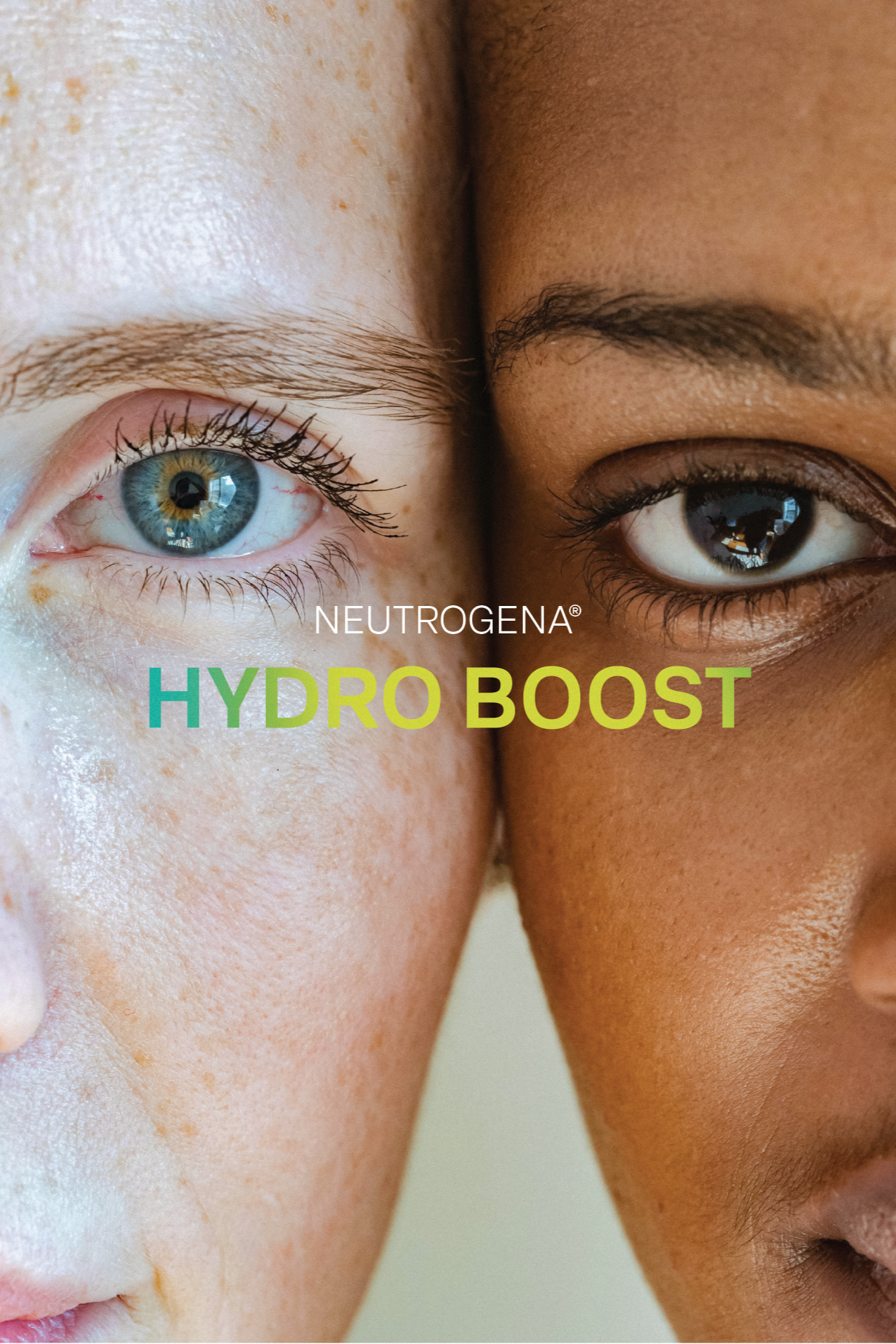
NEUTROGENA® HYDRO BOOST
BRAND IDENTITY + PACKAGING + PROMOTIONAL CONTENT
ADOBE ILLUSTRATOR
ADOBE PHOTOSHOP
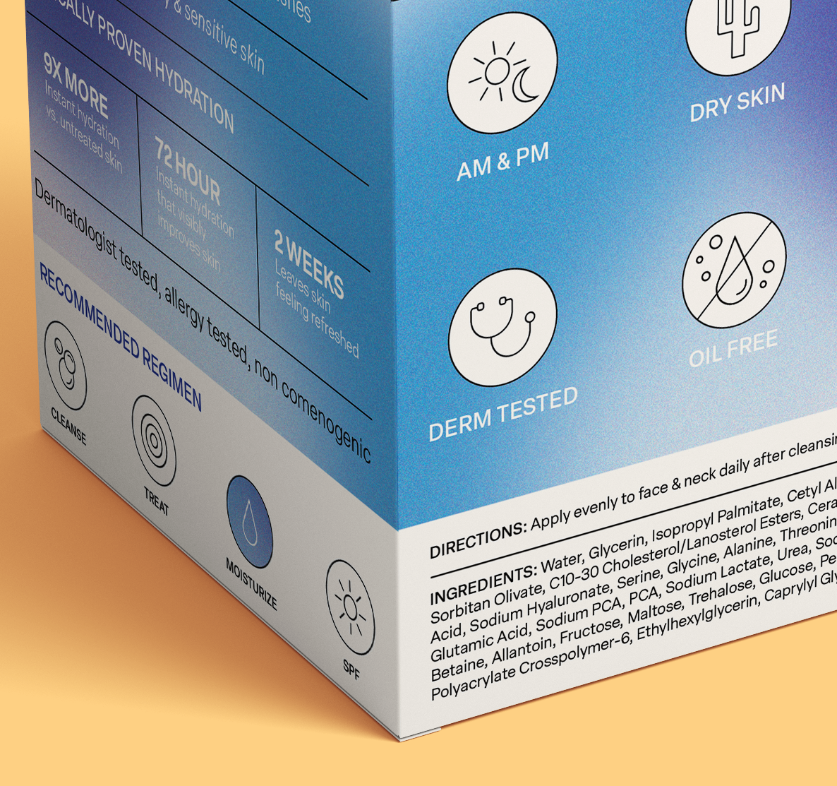
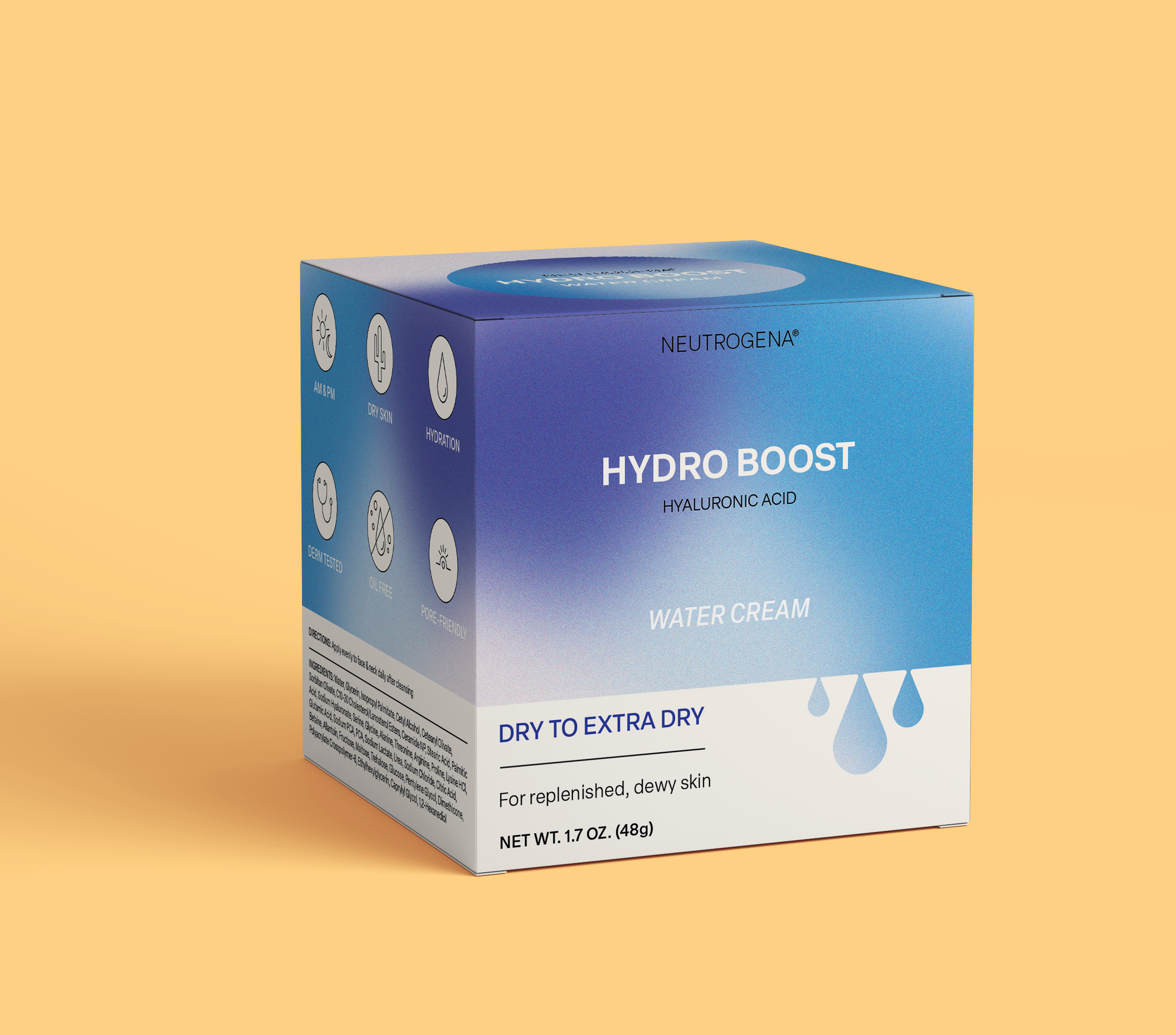
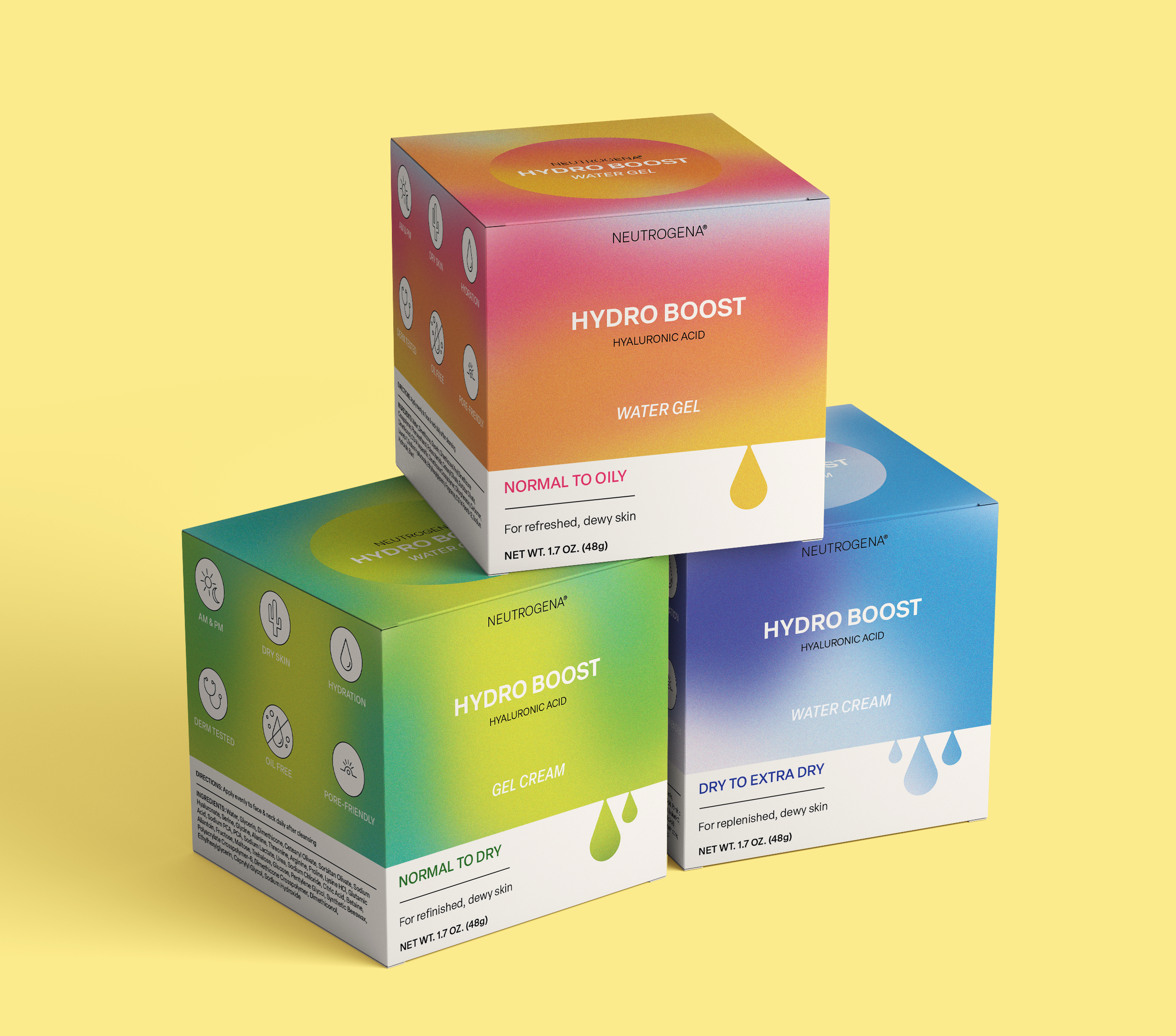
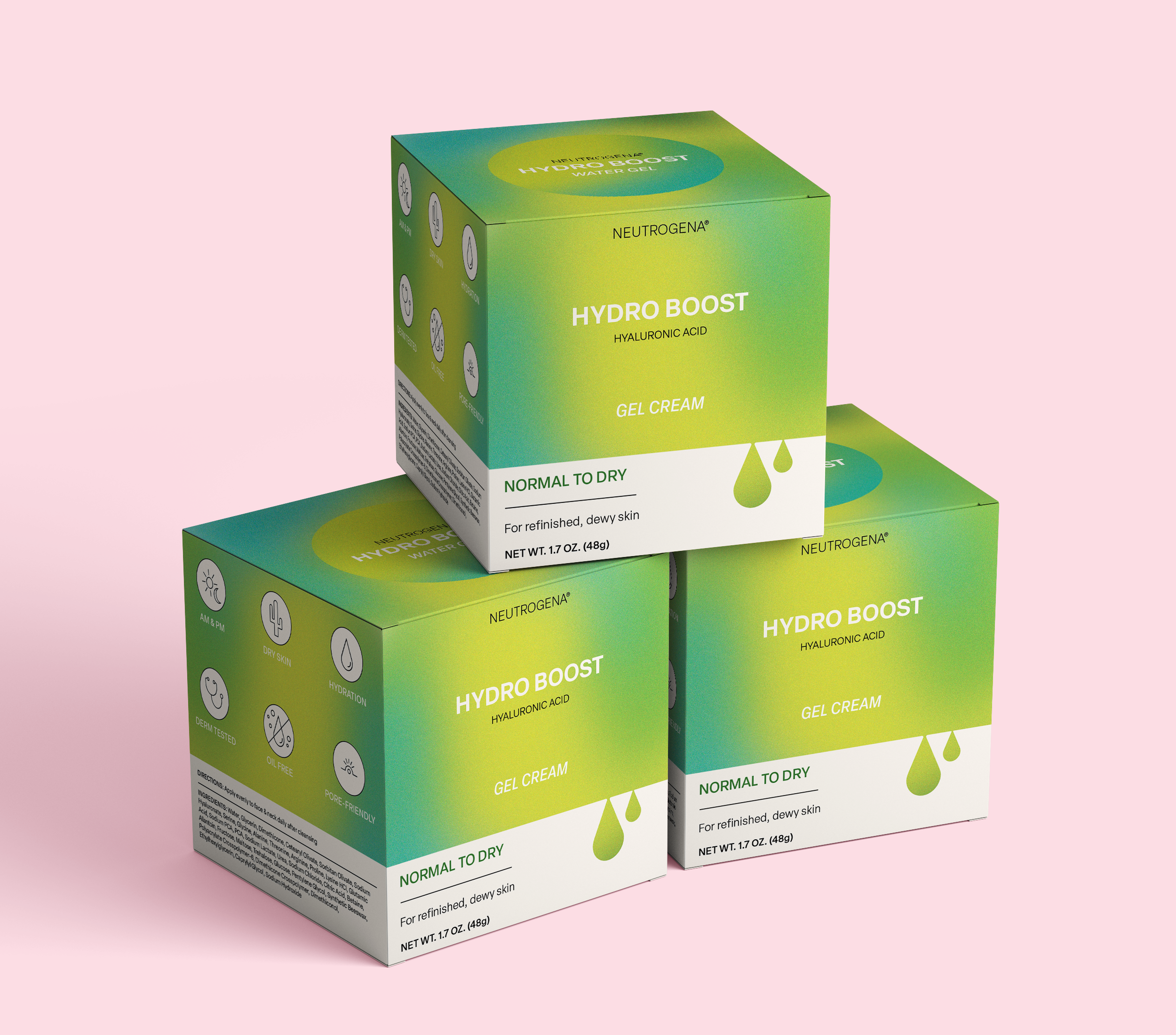
For this student project, I reimagined the packaging system for Neutrogena’s Hydro Boost collection, creating three distinct designs for the Water Gel, Gel Cream, and Water Cream moisturizers. Each concept uses vibrant gradient palettes tied to skin type (Normal to Oily, Normal to Dry, and Dry to Extra Dry) and brings a modern, eye-catching feel to the line. The refreshed system balances Neutrogena’s science-backed credibility with a more experience-driven, youthful aesthetic designed to stand out on today’s shelves.


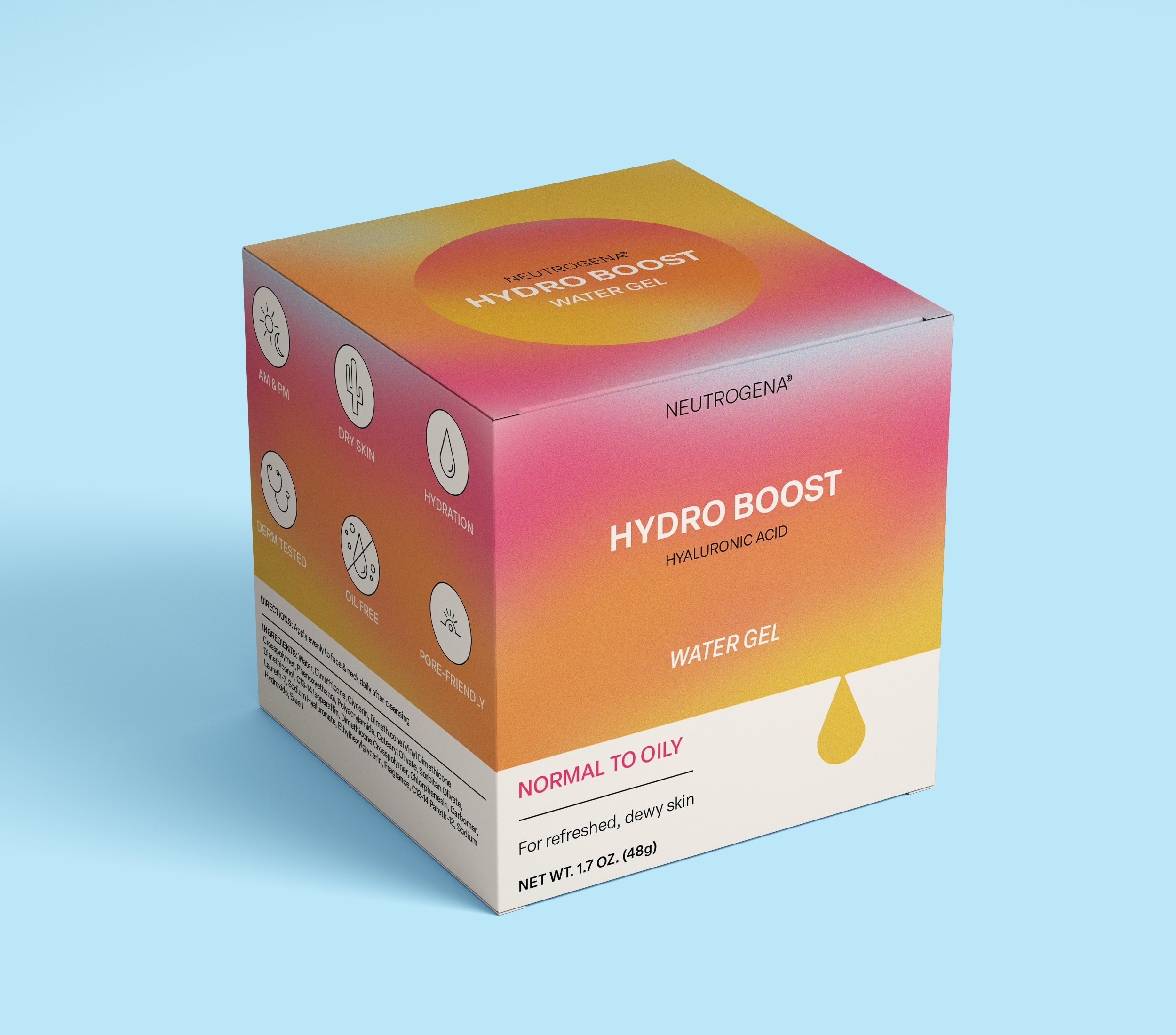
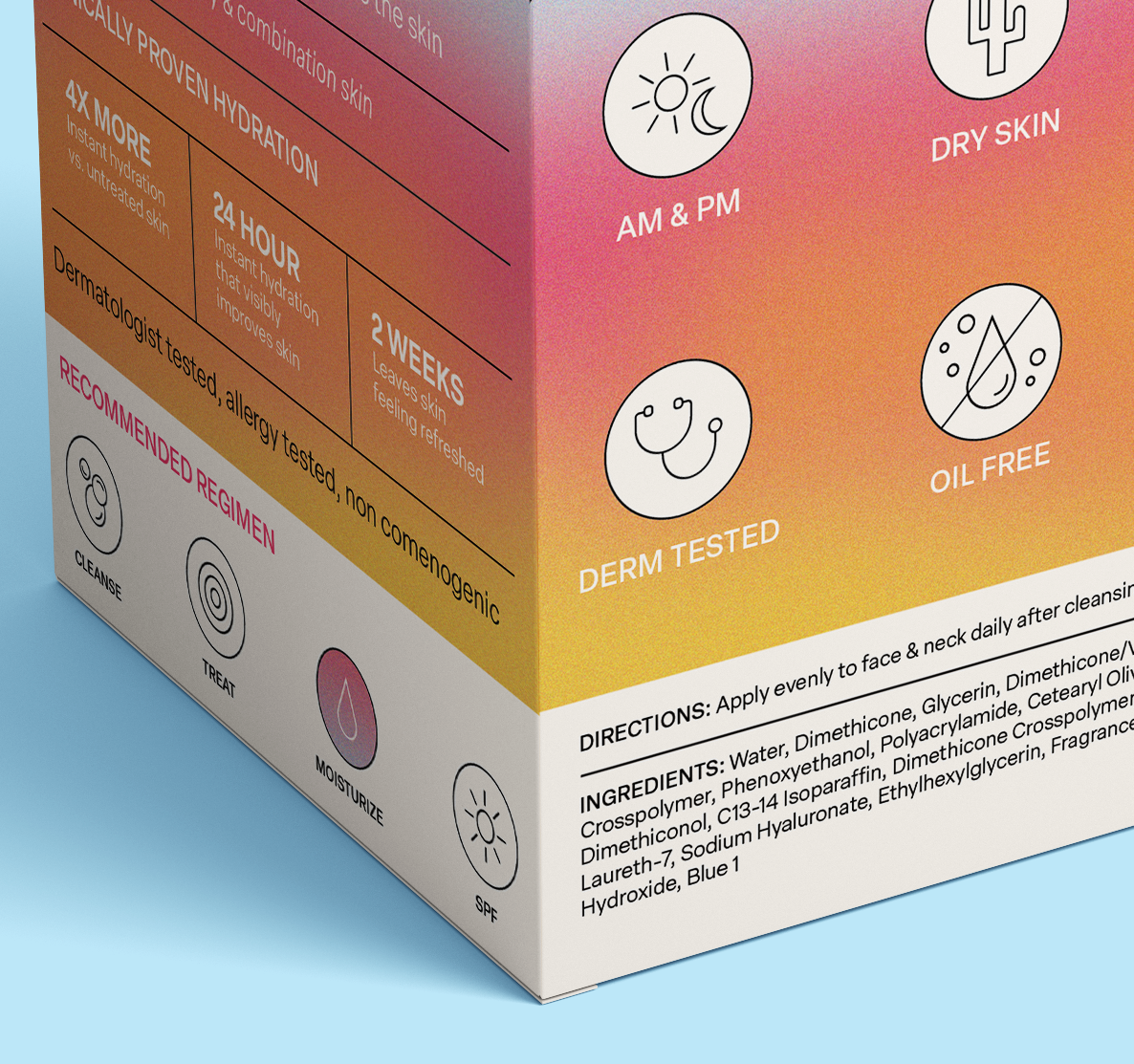
Designed for lightweight hydration without the shine, this bold coral-to-gold gradient packaging reflects the refreshing clarity of the Water Gel formula. Made for oily and combination skin types, it delivers a clean, modern look that still feels approachable, perfect for the minimal-but-mighty skincare routine.
NORMAL TO OILY
WATER GEL


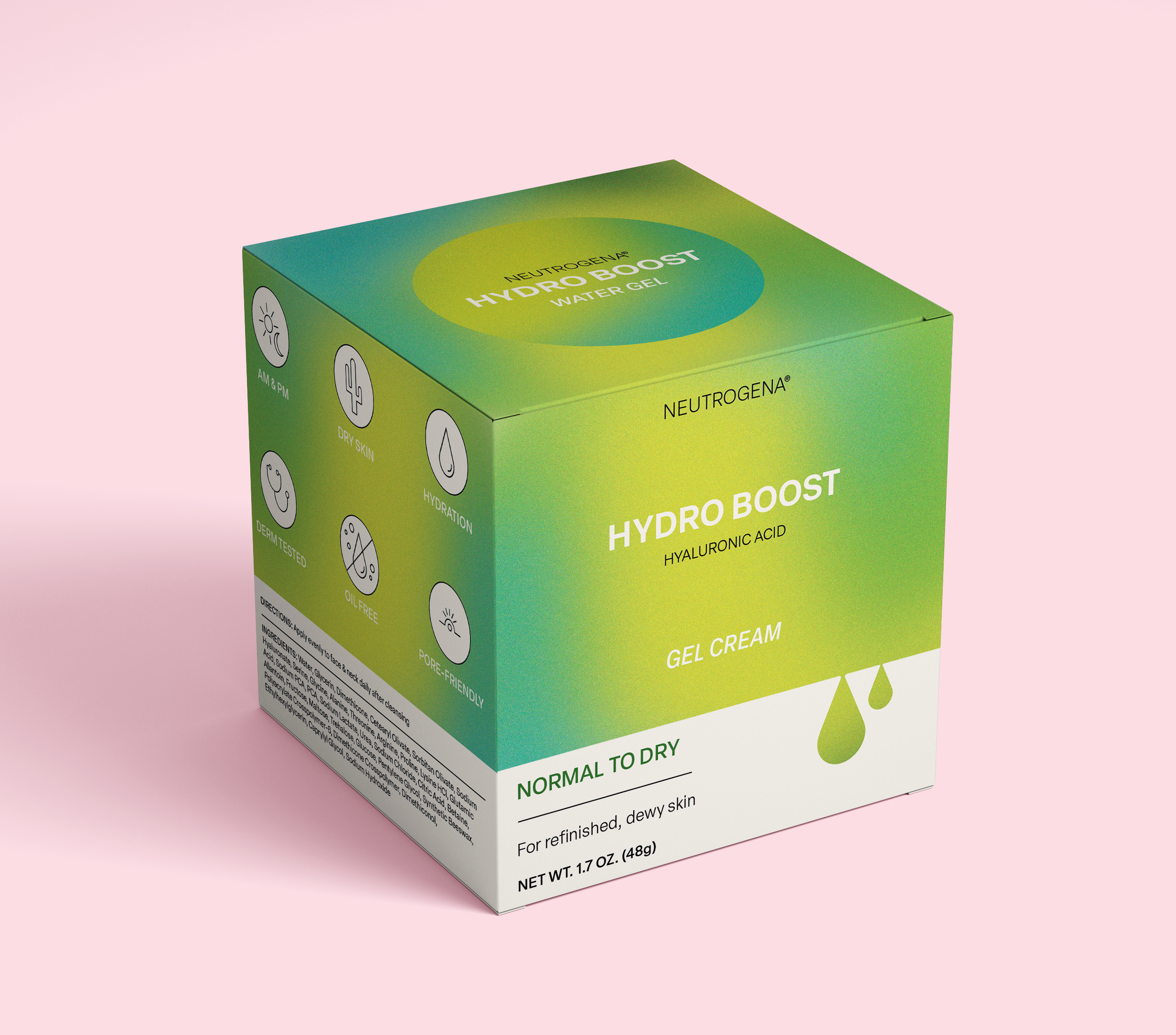
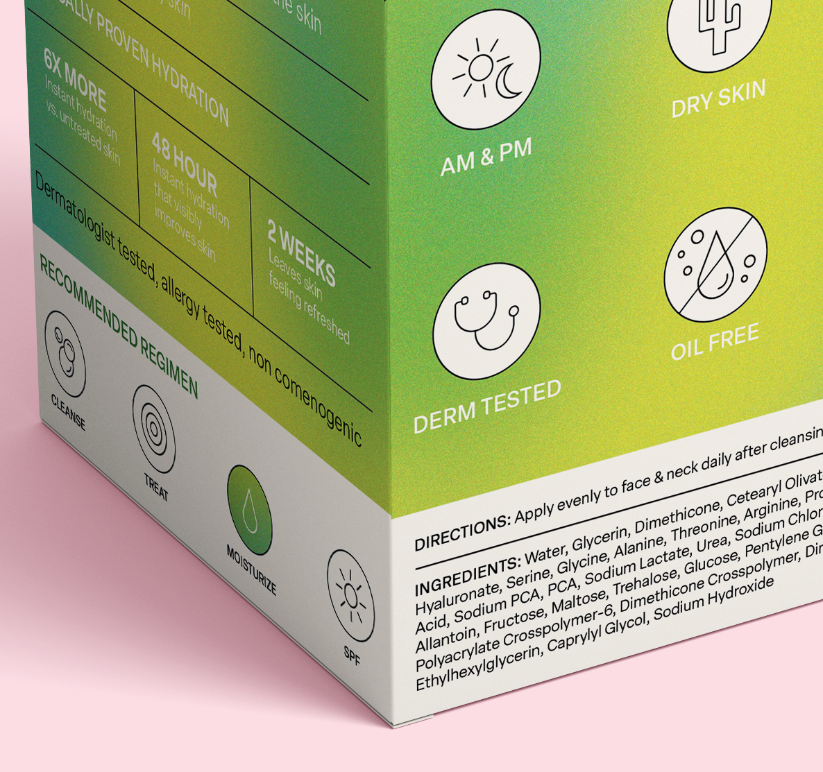
This green-meets-teal gradient brings a soft energy to the Gel Cream, balancing science-backed skincare with a nature-inspired palette. Targeting dry skin with a formula that hydrates without heaviness, this design speaks to wellness lovers who want their products to be as visually nourishing as they are effective.
NORMAL TO DRY
GEL CREAM


For deep hydration with a cooling touch, this packaging blends rich blues with soft violets, an intentional nod to the calm, replenished feeling of truly quenched skin. Ideal for ultra-dry complexions, this design positions the Water Cream as a luxurious, dermatologist-trusted staple for modern routines.
DRY TO EXTRA DRY
WATER CREAM