SYNERGY KOMBUCHA
BRAND IDENTITY + PACKAGING + PHOTOGRAPHY + ART DIRECTION
ADOBE ILLUSTRATOR
ADOBE PHOTOSHOP
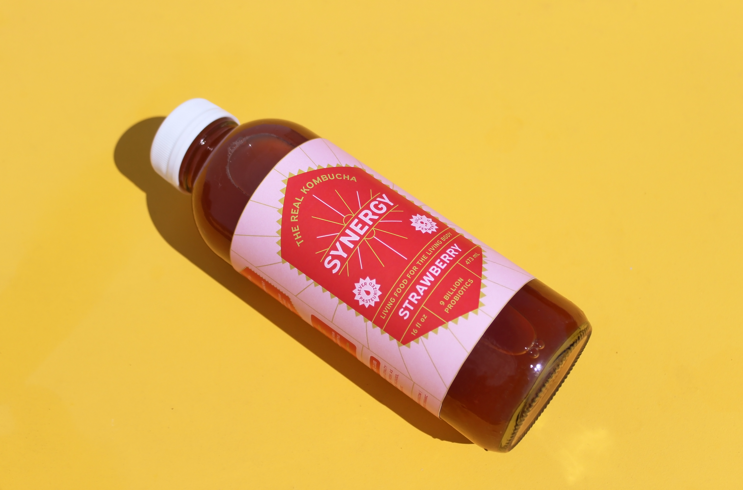
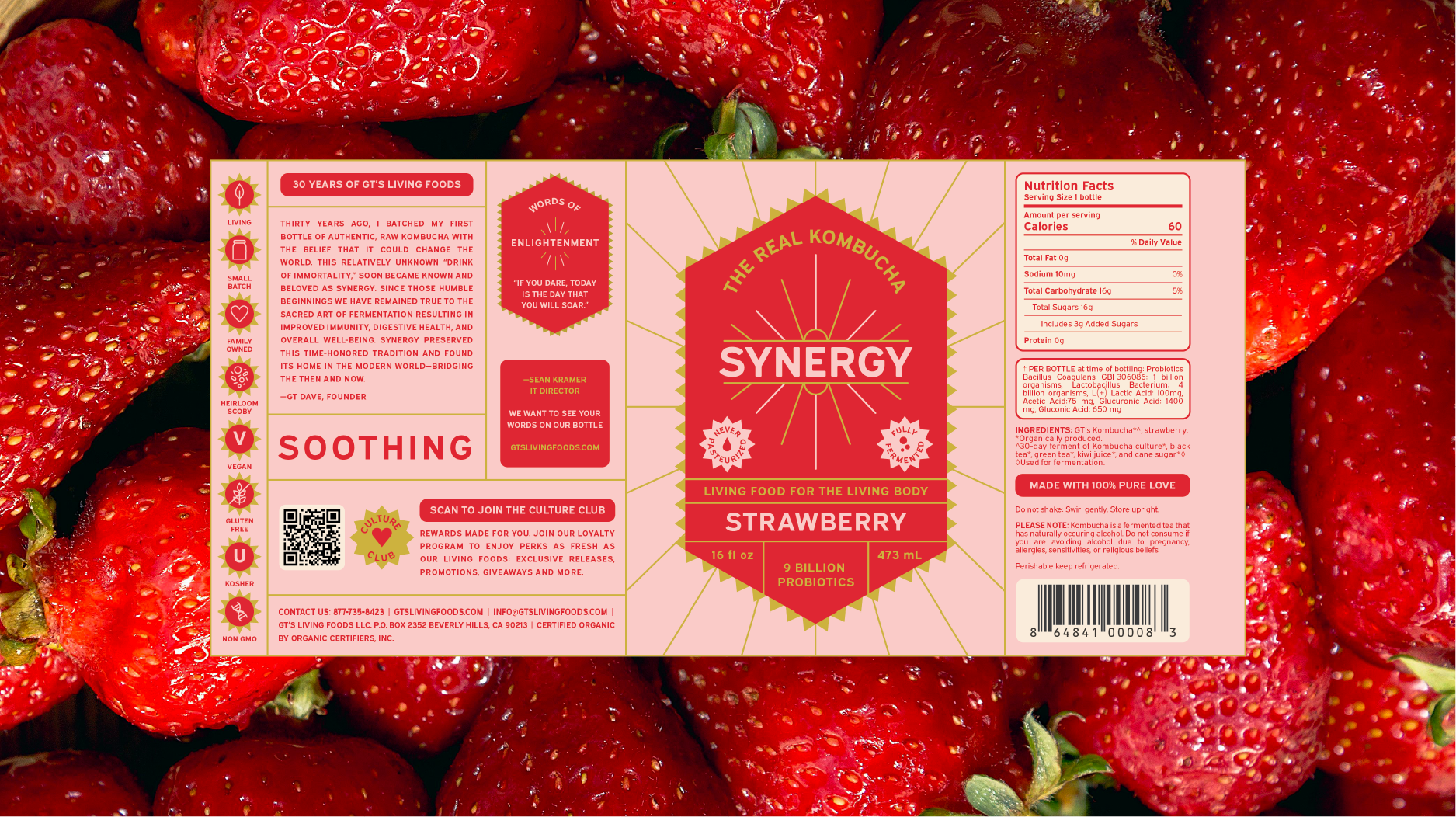
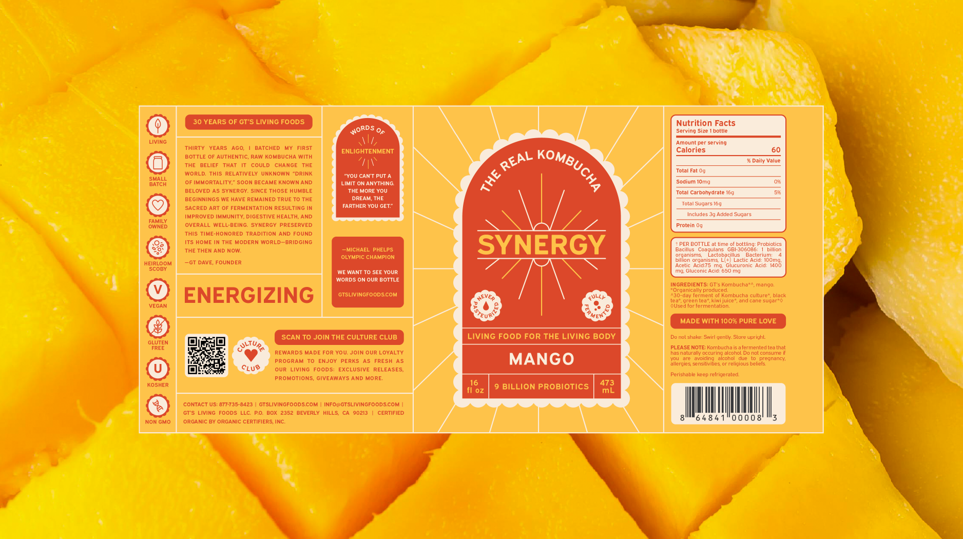
As part of a student design project, I reimagined the packaging for Synergy Kombucha to better connect with a younger, trend-savvy audience while honoring the brand’s authentic roots. Each flavor features a bold, sunburst-inspired design and a vibrant color palette that reflects the energizing benefits inside every bottle. I also photographed the final set to capture the bright, joyful essence of this refreshed concept.

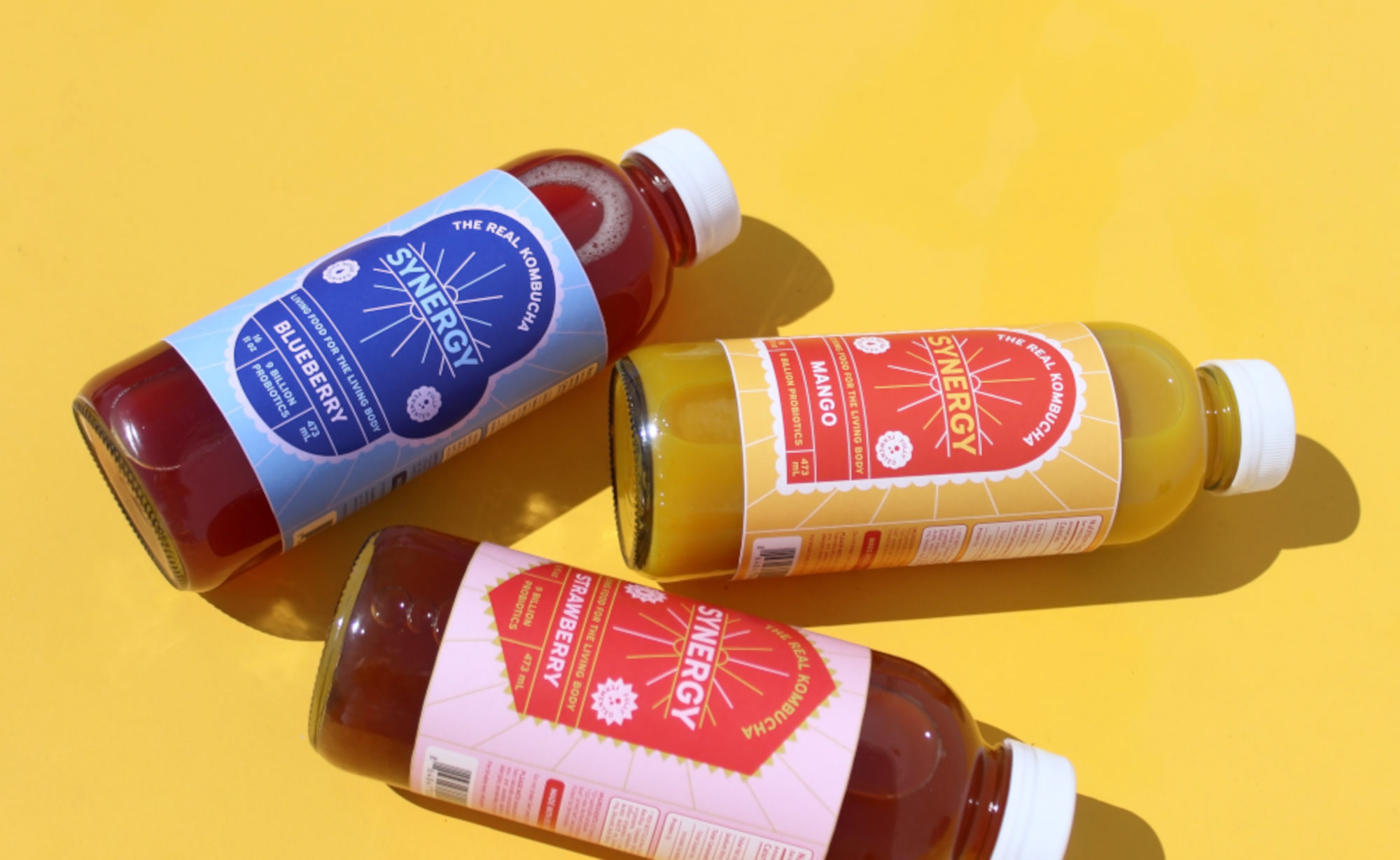
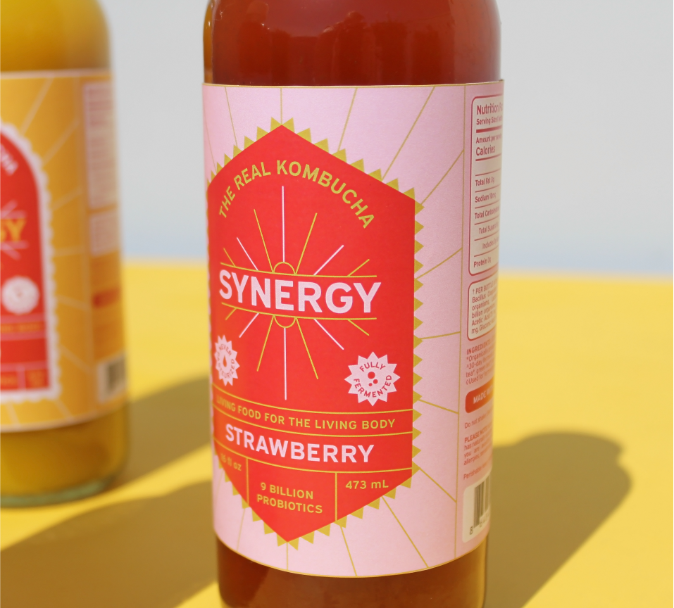

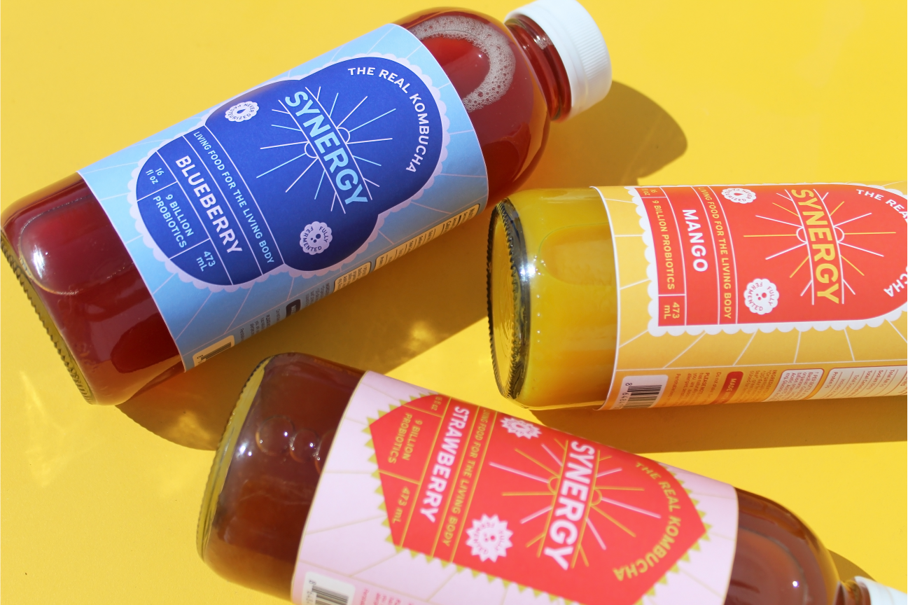


STRAWBERRY
SOOTHING
This design leans into clean lines and vibrant color to create a sense of energy and freshness. Repeating elements help unify it with the rest of the series, while the overall tone stays light and uplifting, never too sweet or overly youthful.

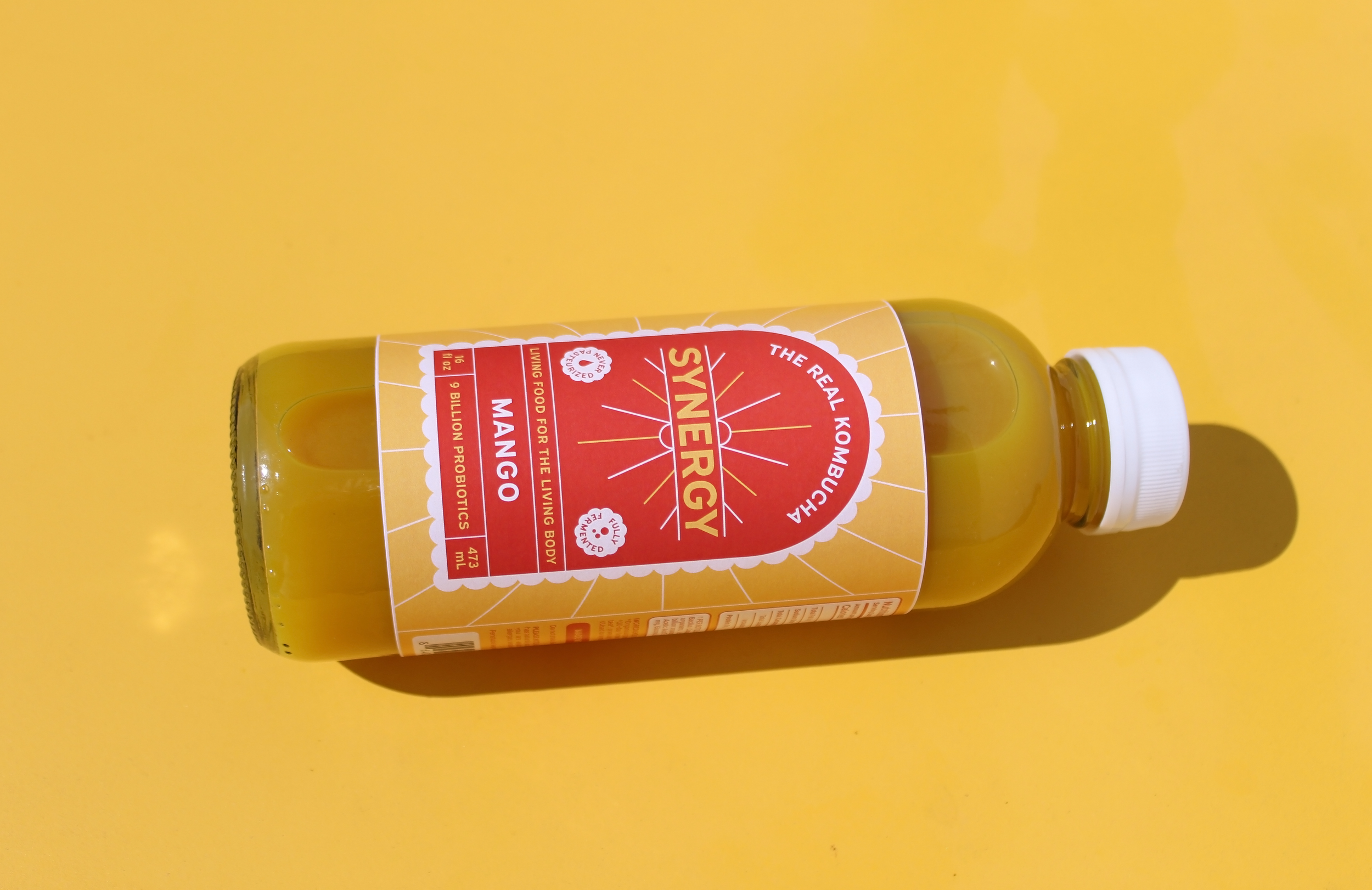
This design plays with warmth and contrast, layering golden yellows and soft oranges to evoke the flavor’s brightness. I wanted the Mango label to feel approachable and uplifting, with a slightly playful tone that leans into the fun side of kombucha.
ENERGIZING
MANGO

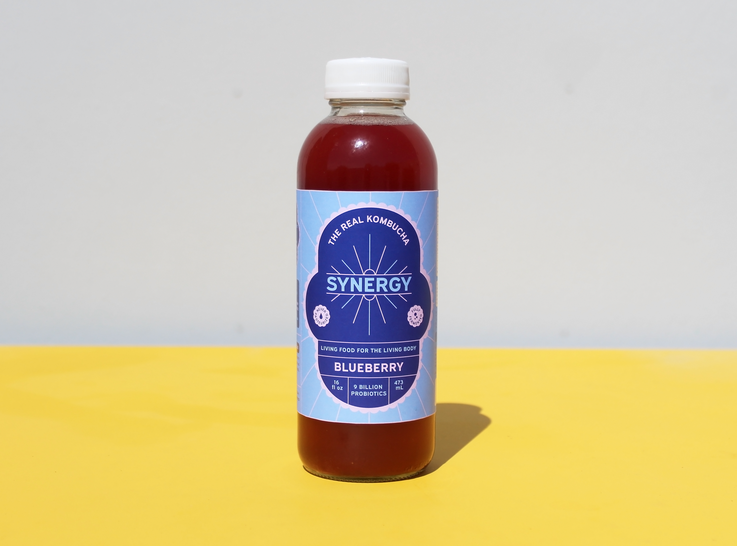
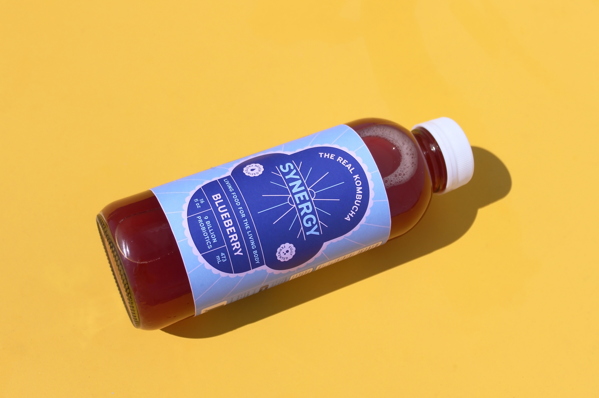
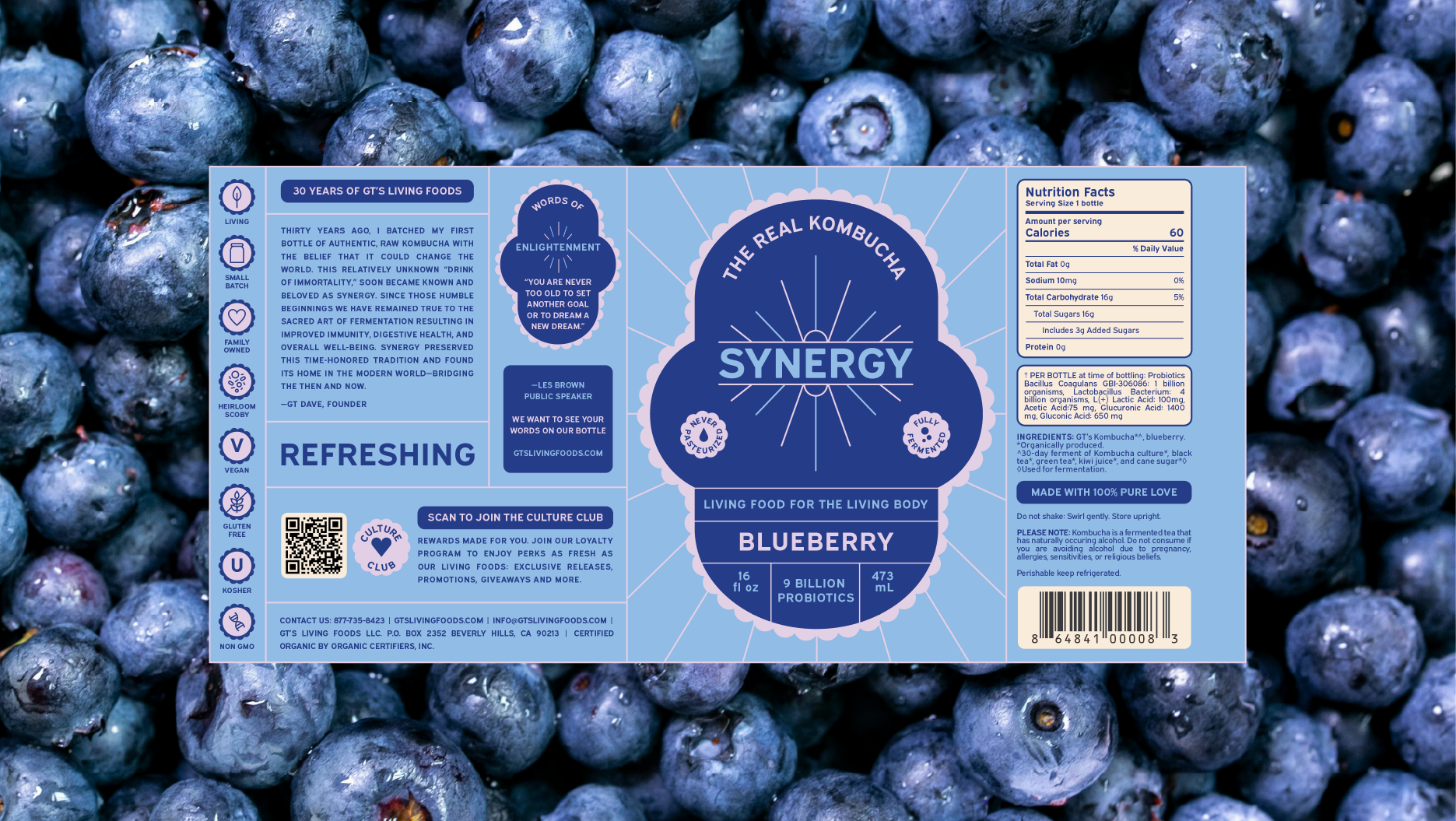
For the Blueberry flavor, I used deep indigo and violet tones to reflect the richness of the ingredients while introducing a more contemporary visual identity. The burst motif adds movement and energy, helping the label feel fresh without losing its grounding in tradition.
REFRESHING
BLUEBERRY