

HUCKLEBEE FARMER’S CO-OP
BRANDING + PACKAGING + ILLUSTRATION + MOTION + WEB
FIGMA
ADOBE ILLUSTRATOR
ADOBE PHOTOSHOP
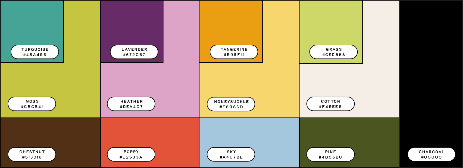
Hucklebee Farmer’s Cooperative is a conceptual branding project I worked on alongside Abby Sheets, Hadden Young, and Isabella Doughty. Together, we built the brand from the ground up, dividing responsibilities based on our individual strengths. My primary contributions included developing the color system and packaging design, while also collaborating on the overall brand concept and visual direction.
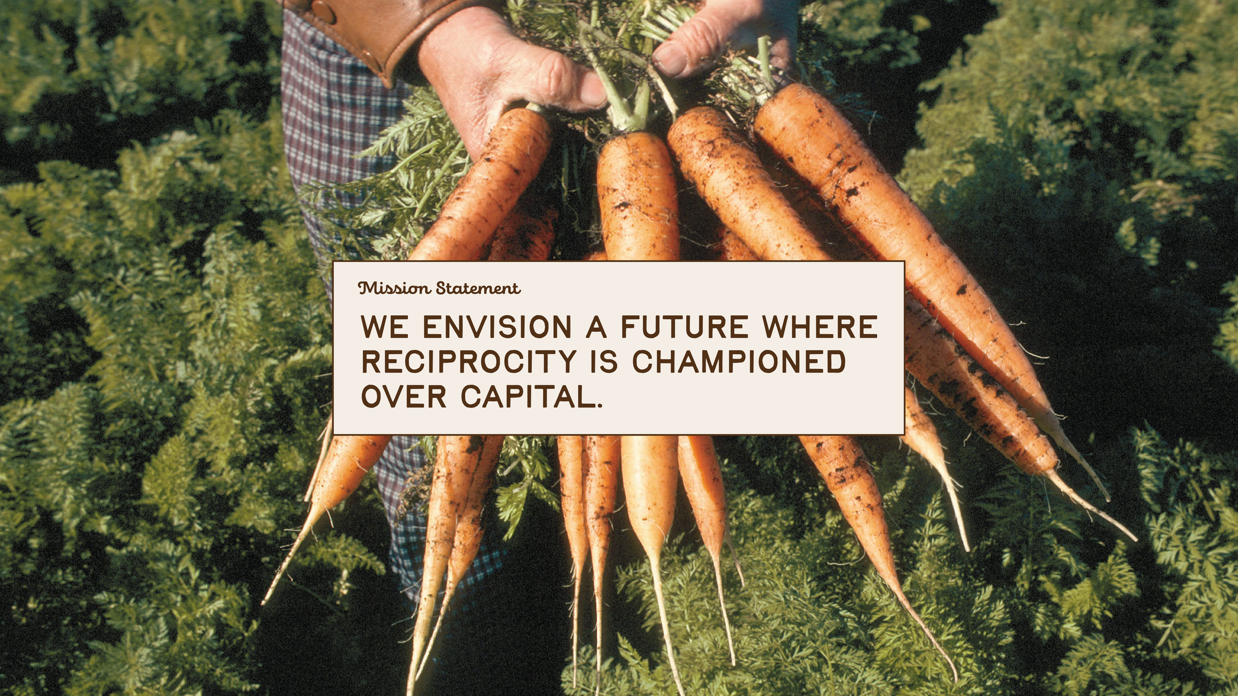
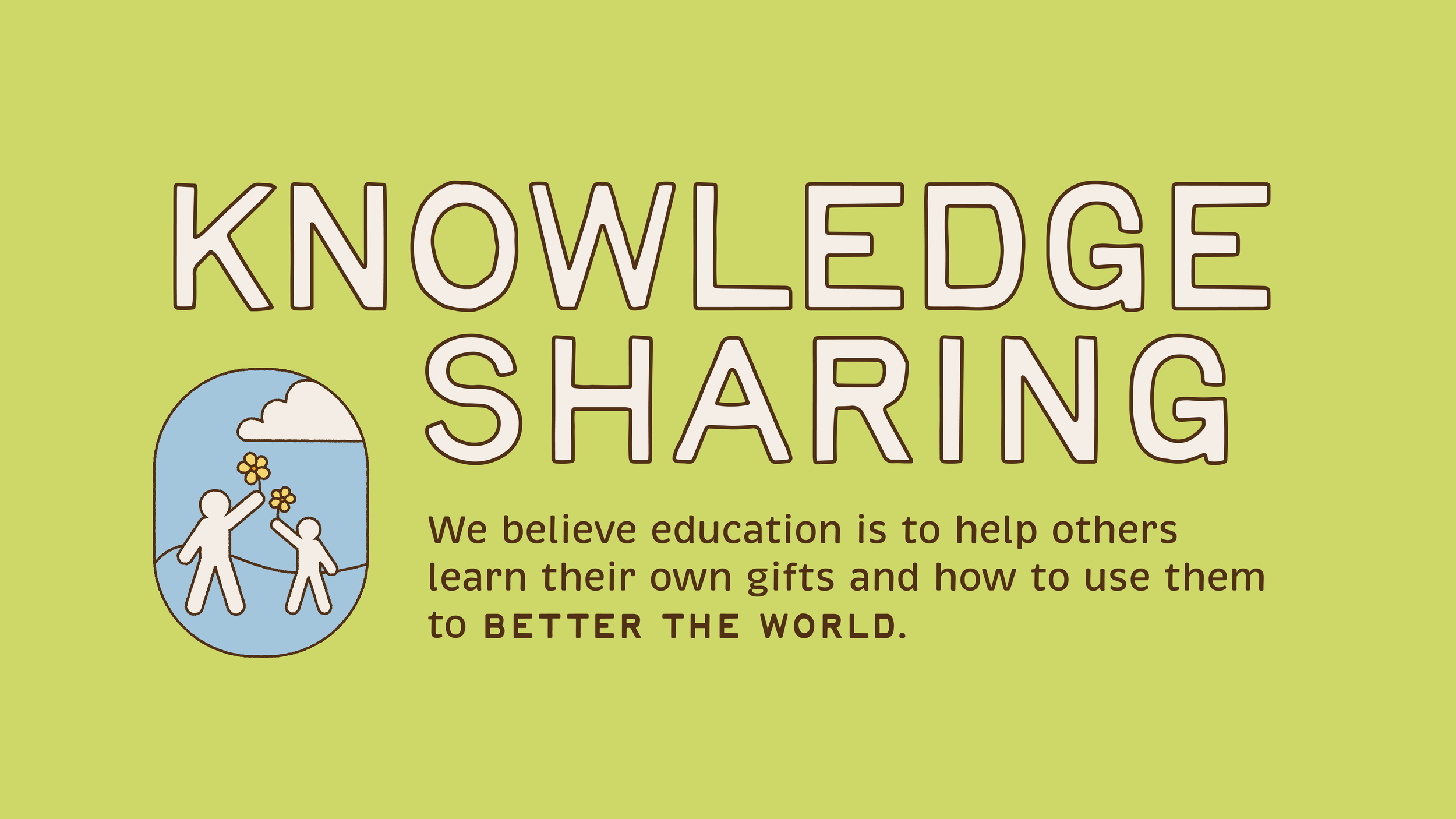
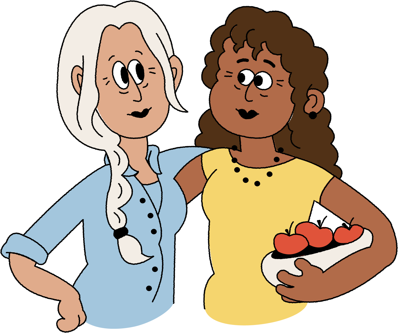
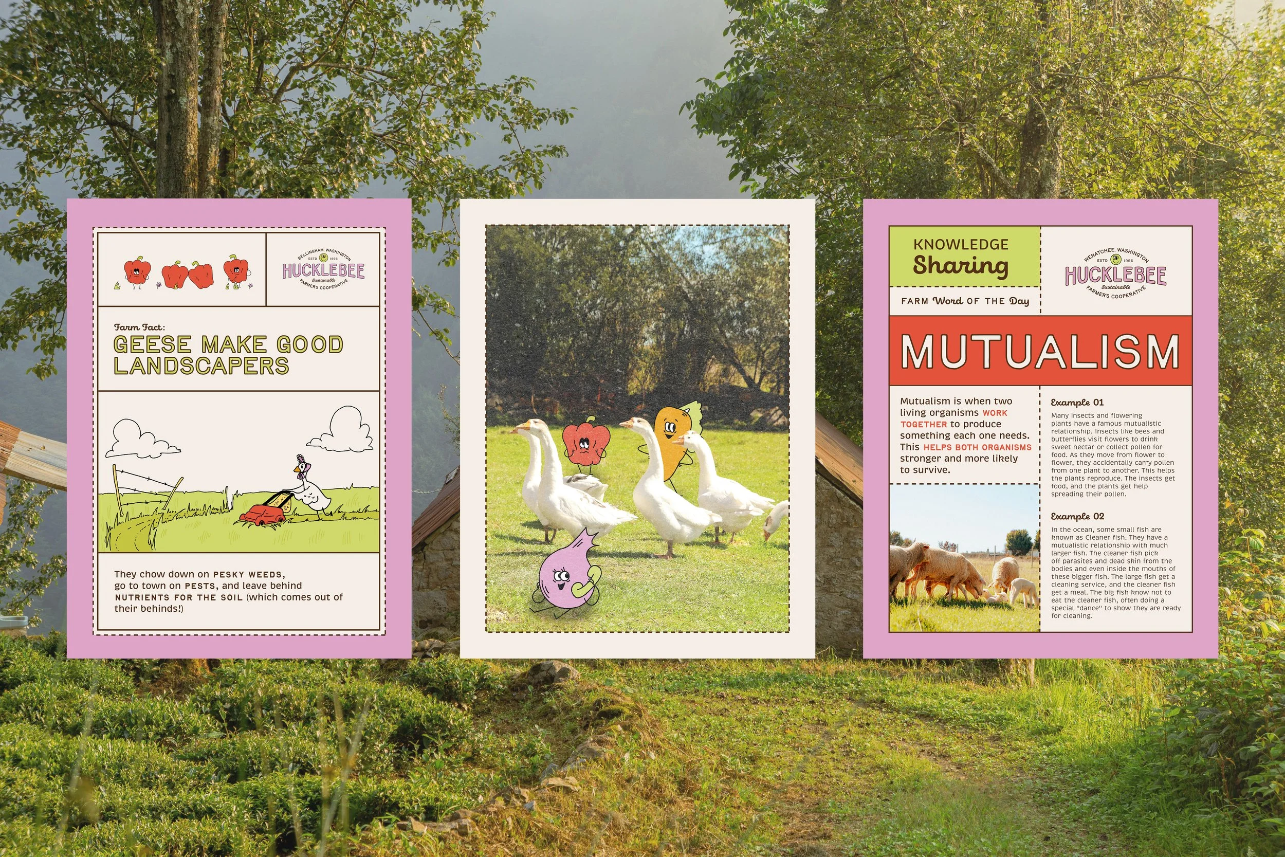
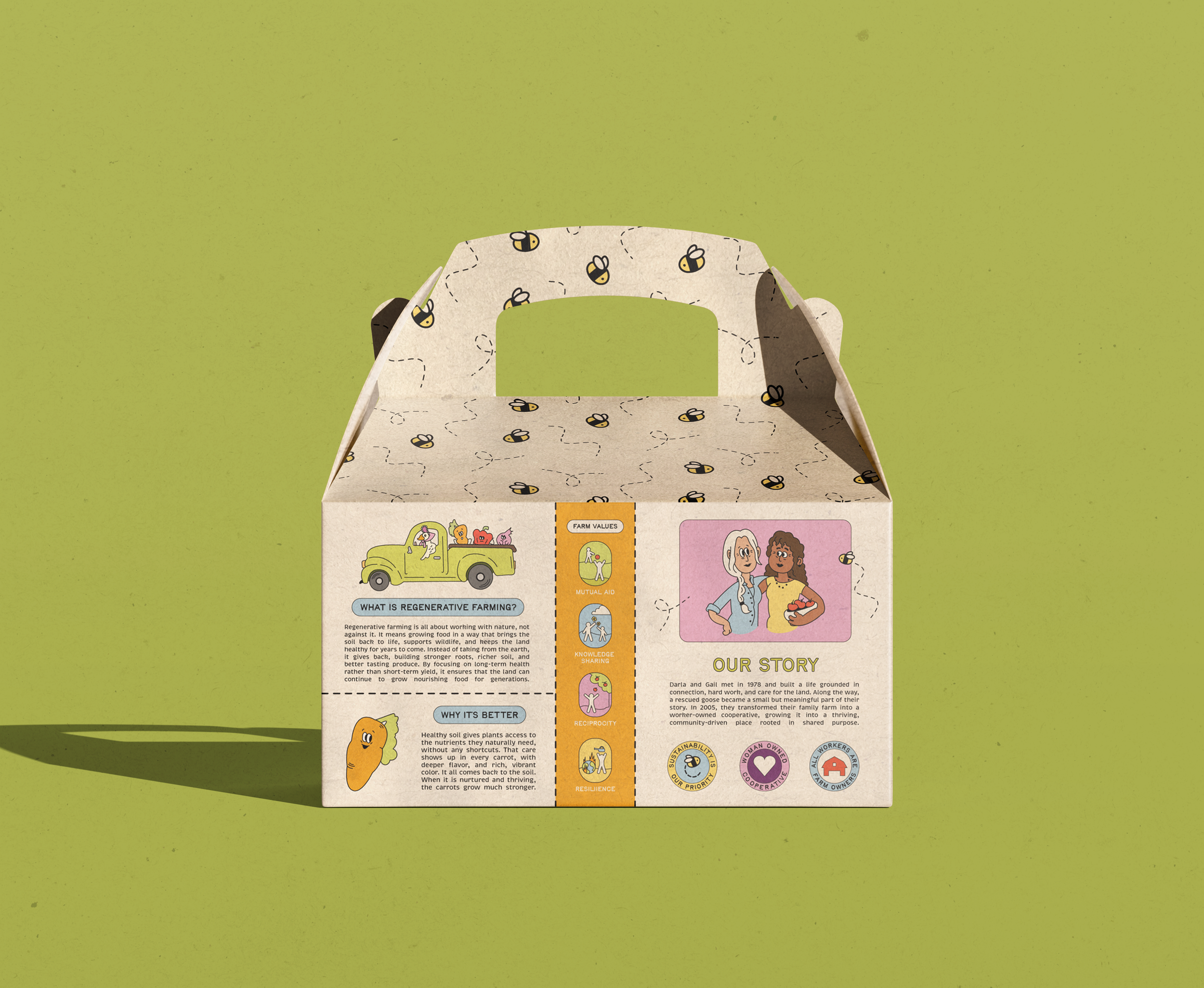
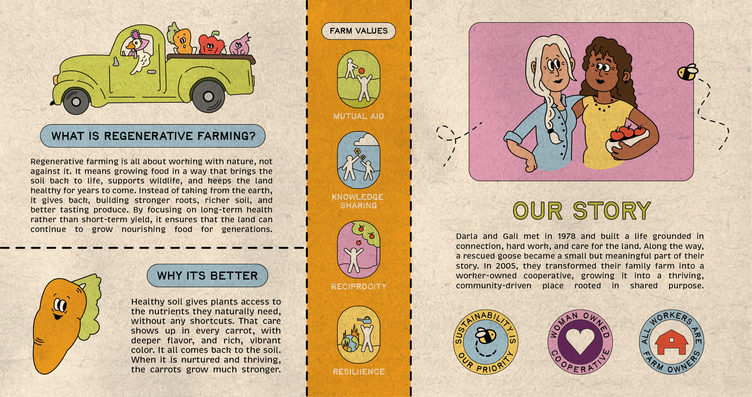
Our goal was to create a playful and community driven identity that moved away from the typical organic farm aesthetic. Inspired by Hucklebee’s focus on education and regenerative agriculture, we created a bright, cartoon inspired visual system designed to connect with audiences across generations. The brand story centers around Darla and Gail, who transformed their family farm into a worker owned cooperative rooted in community, sustainability, and shared purpose, with a rescued goose named Hucklebee becoming a meaningful symbol throughout the brand.
KATE ALLEN
Brand Concept
Packaging
Color System
LOGO MARK
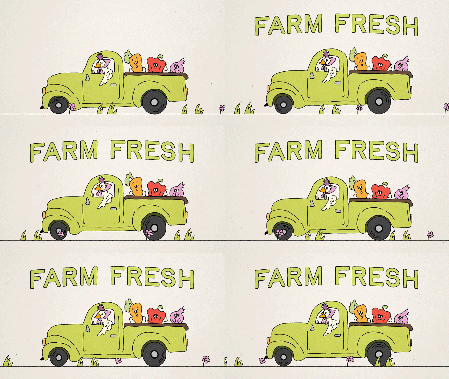
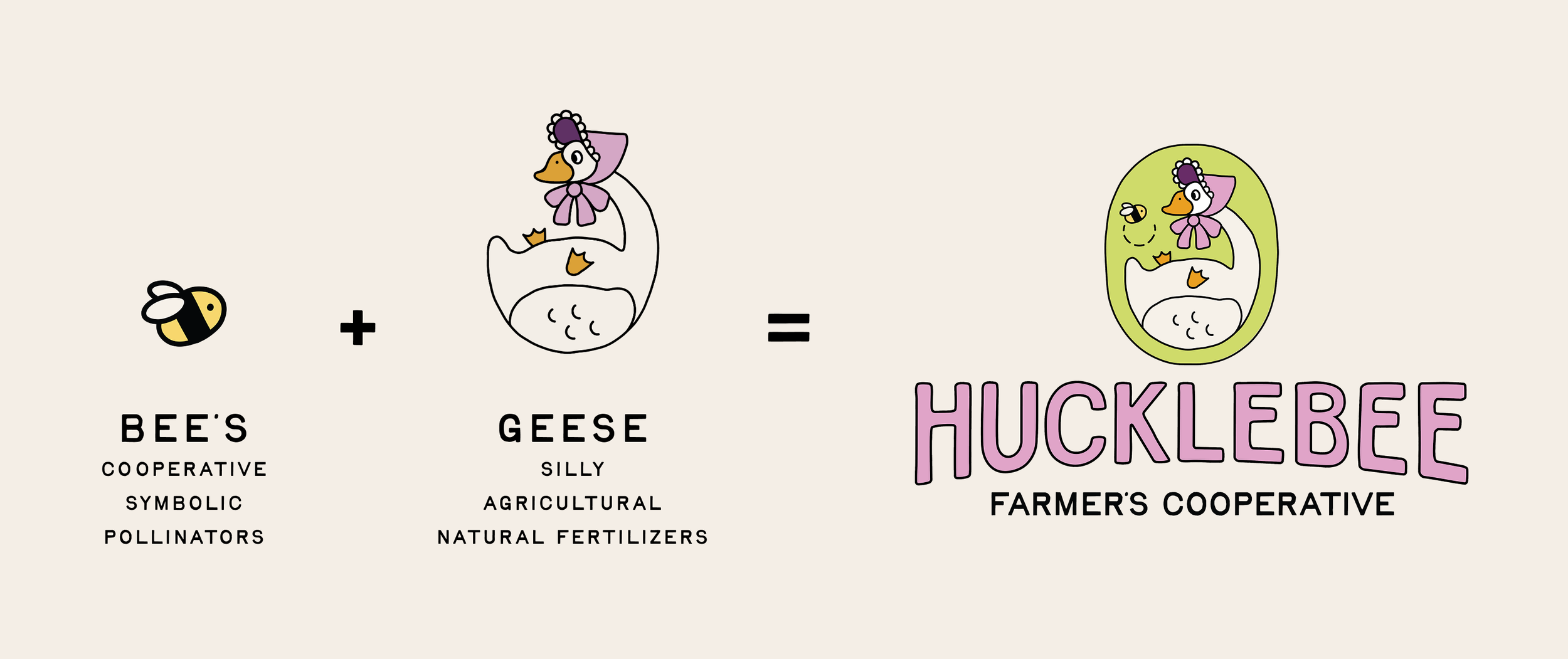
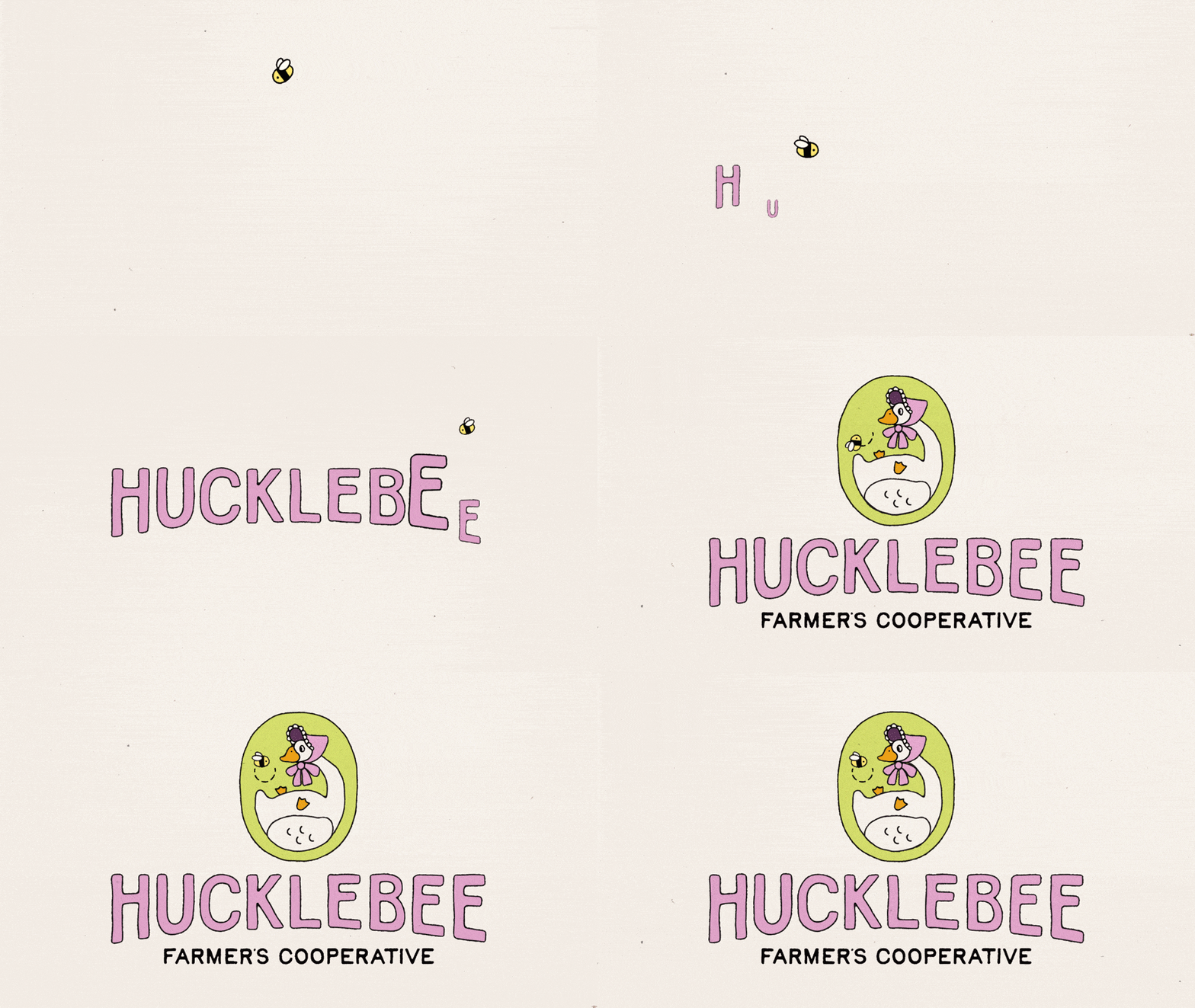
The Hucklebee logo mark was inspired by the fictional goose that Gail and Darla rescued on their farm, named Hucklebee. The mark combines elements of both a bee and a goose, symbolizing cooperation, pollination, and agriculture. The goose’s bonnet adds a playful nod to the brand’s personality and storytelling. The logo is paired with a customized sans-serif typeface featuring a bold outline and fill, creating a visual identity that feels approachable, energetic, and full of character.
COLOR SYSTEM
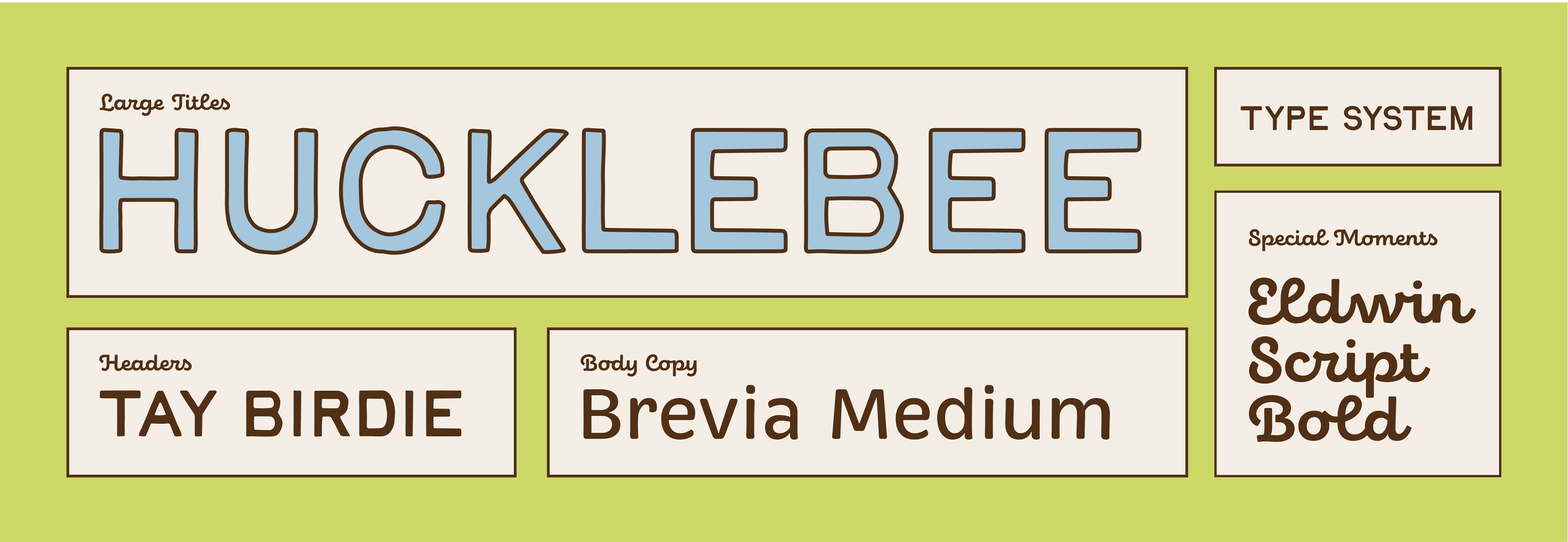
TYPE SYSTEM
ILLUSTRATION SYSTEM
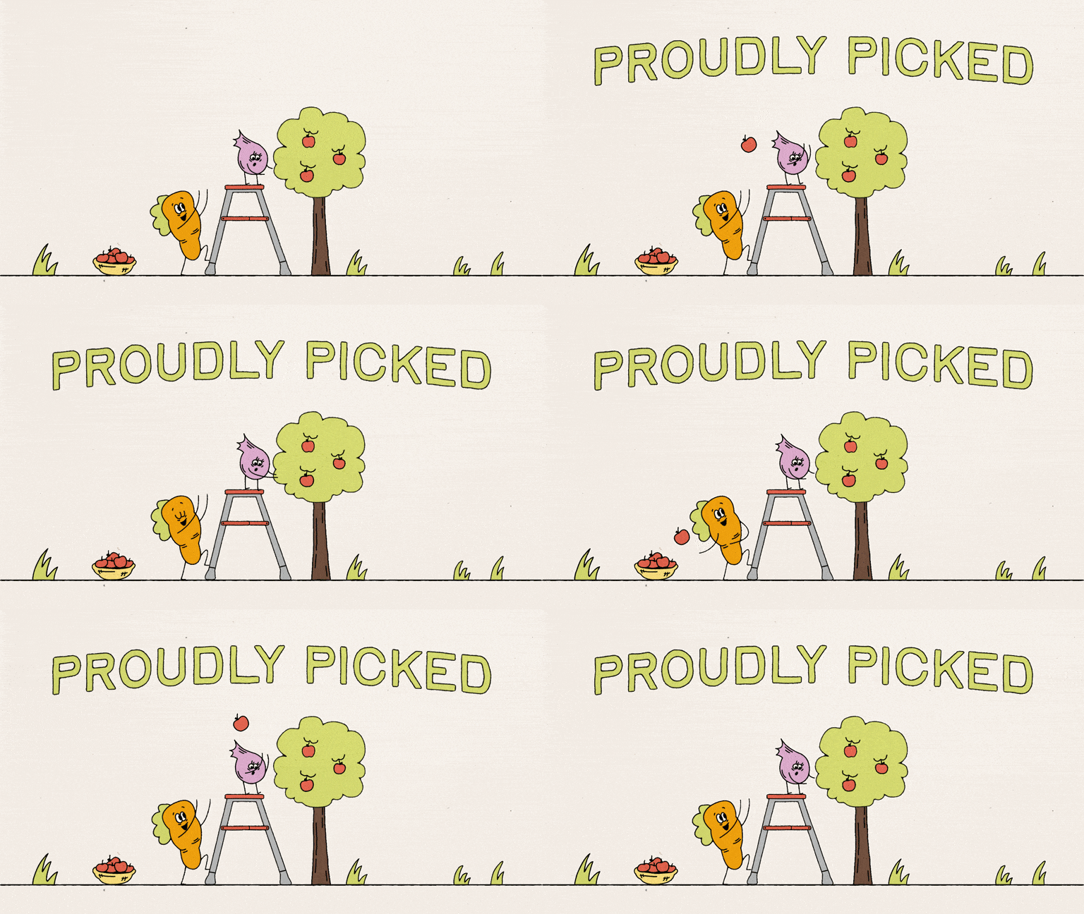
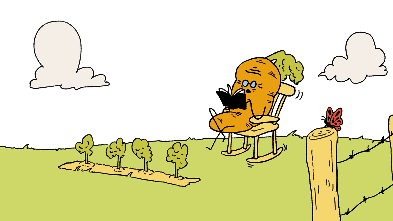
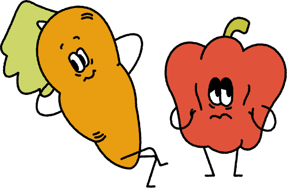
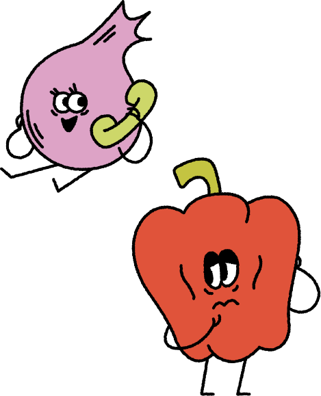
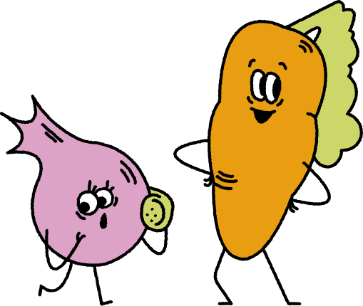
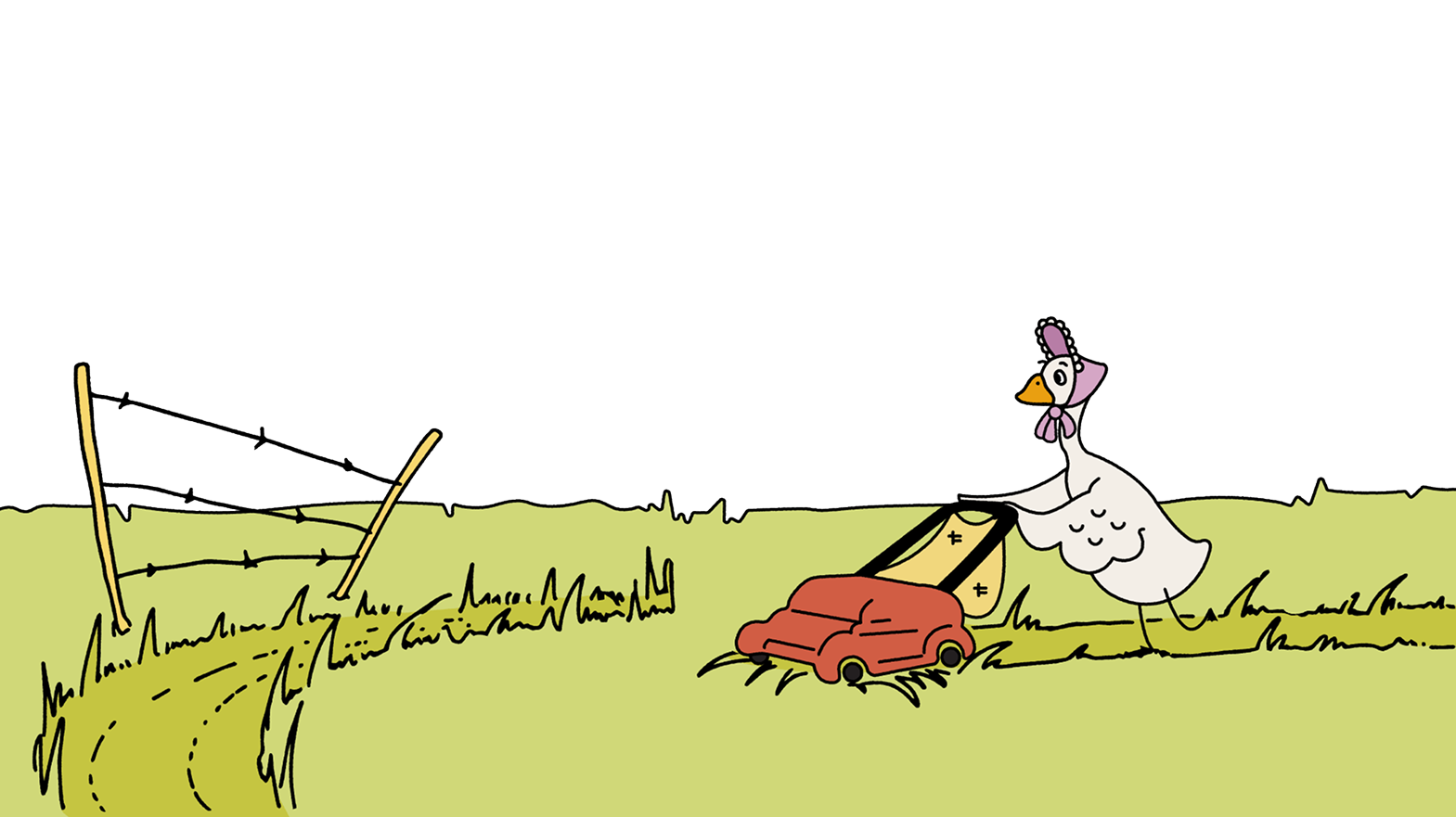
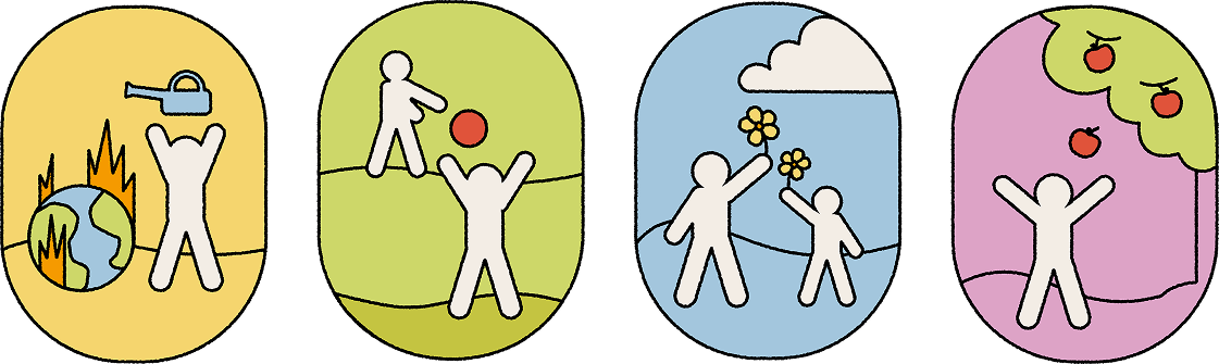
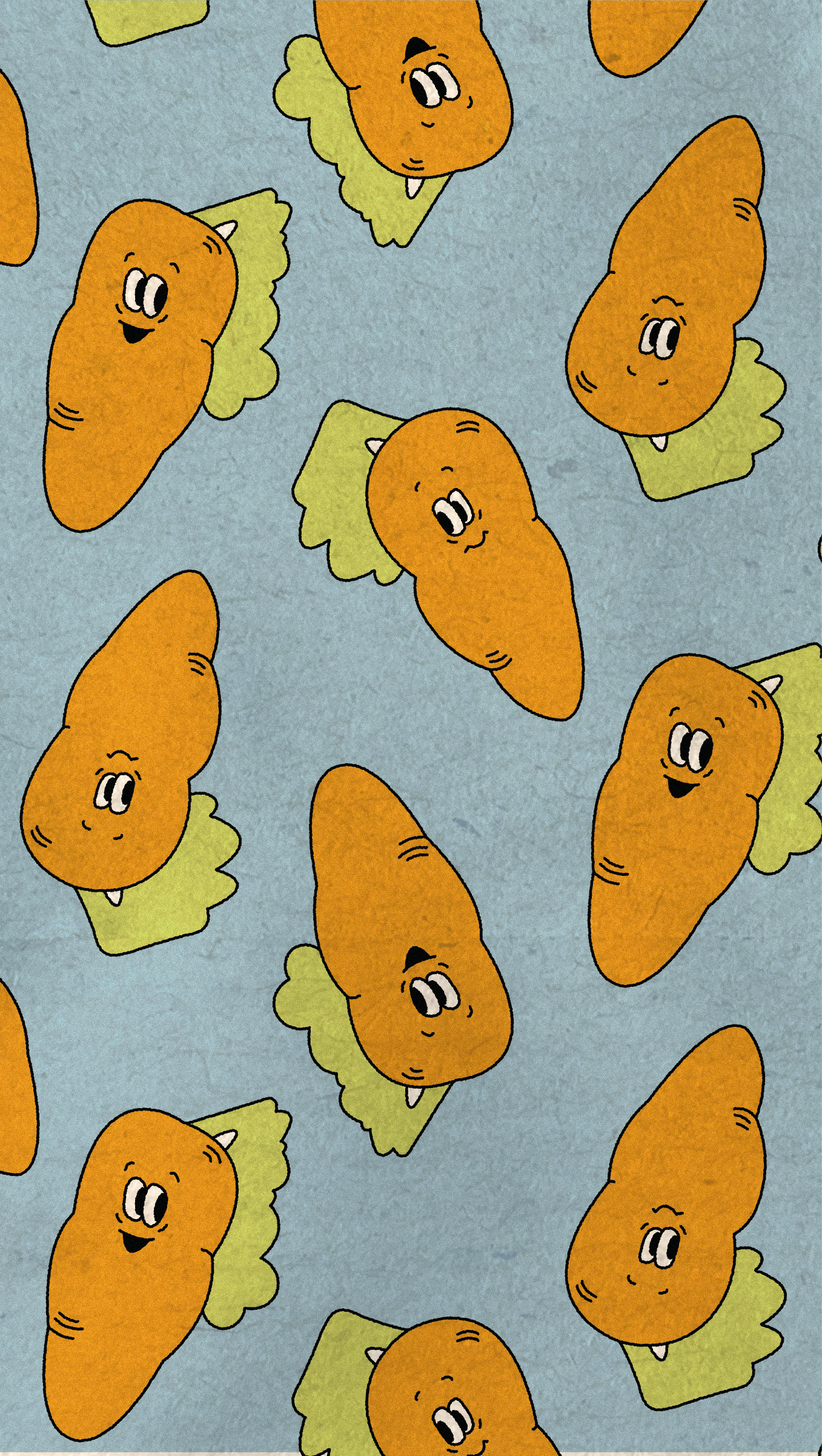
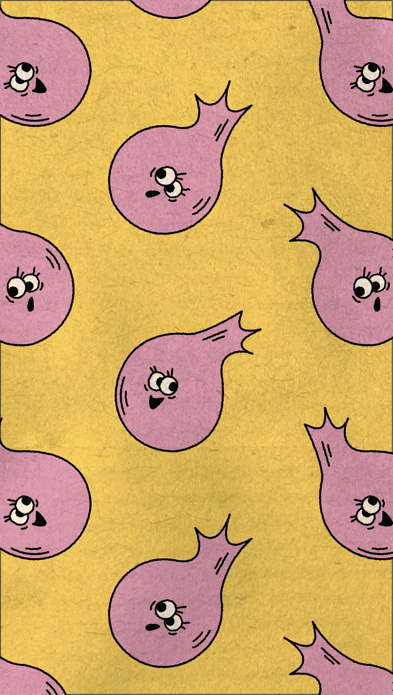
Hucklebee is a cooperative rooted in community and collaboration, and we wanted the illustration system to reflect those values through a connected family of characters. The illustrations were designed in one expressive and playful style that could extend across all areas of the brand identity. Our illustrator, Isabella Doughty, created a flexible illustration system that became a key part of the brand’s visual language and allowed us to develop cohesive brand extensions throughout the project.
PACKAGING
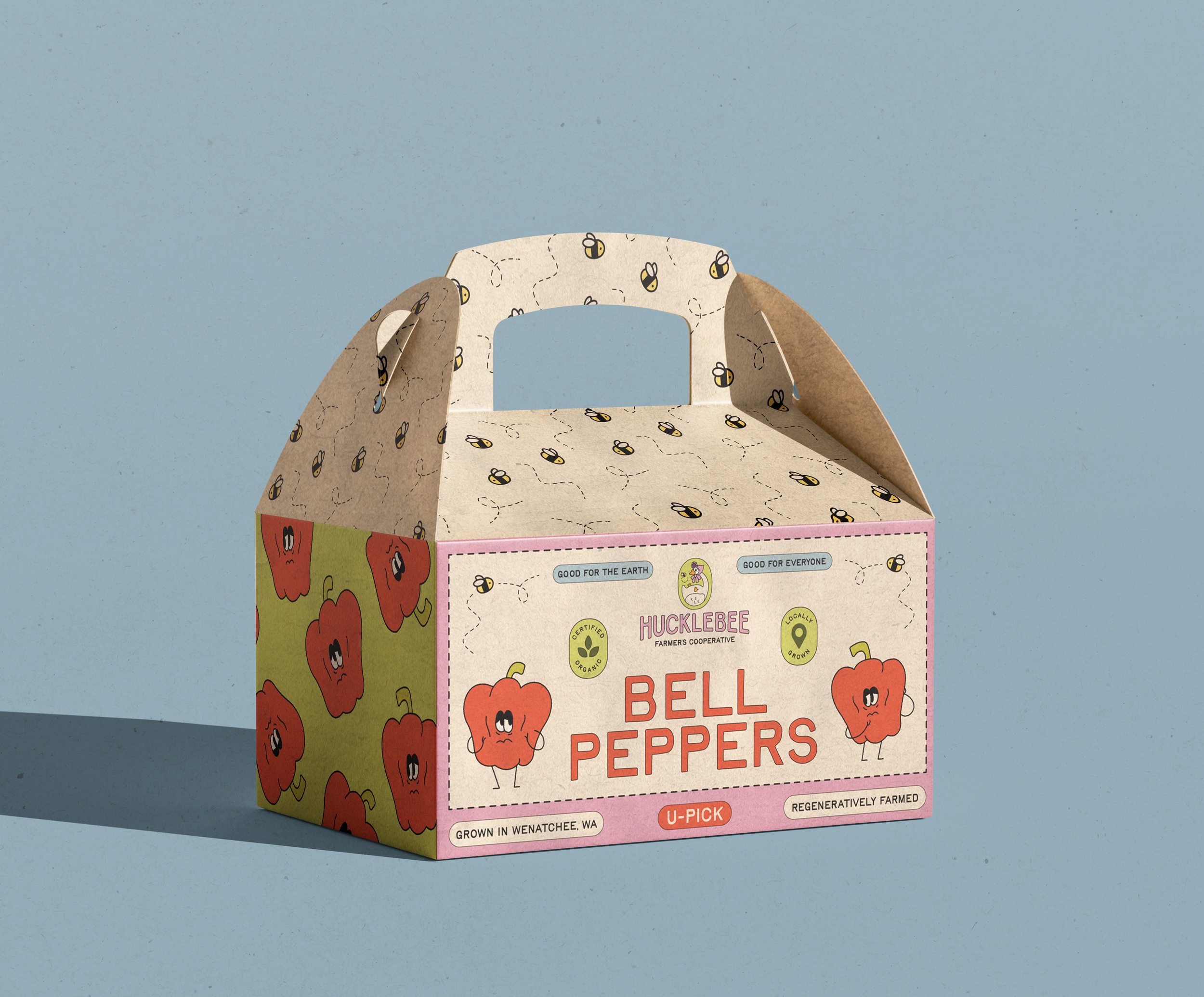
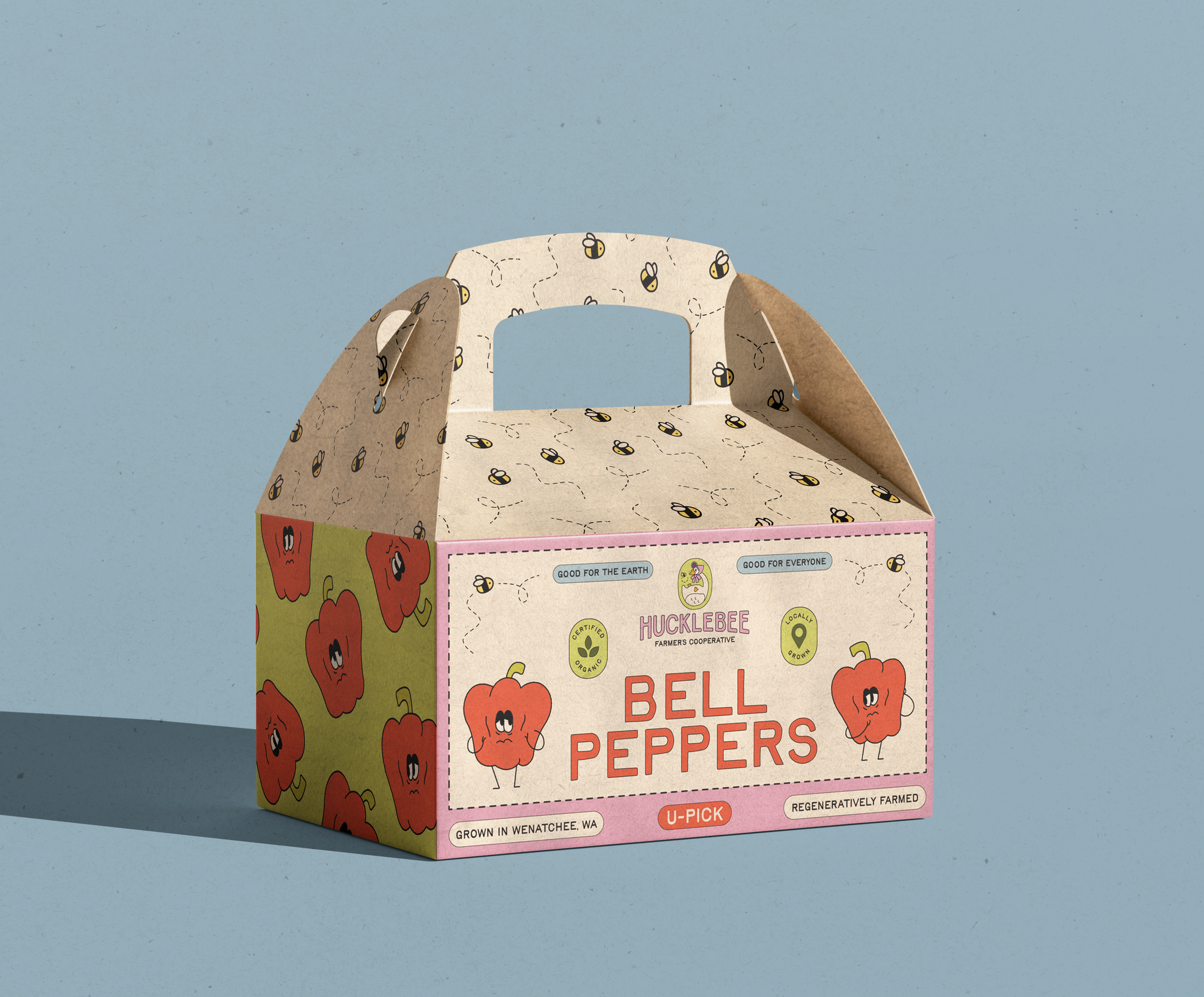
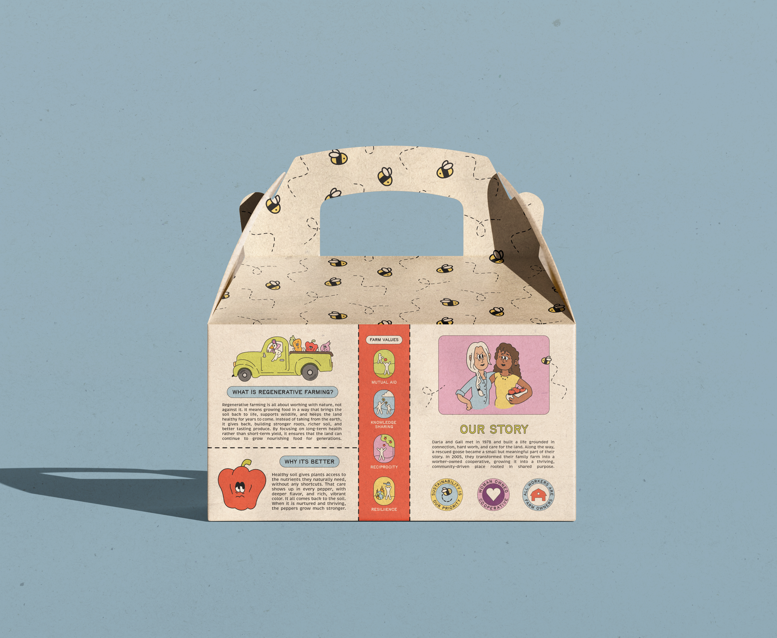
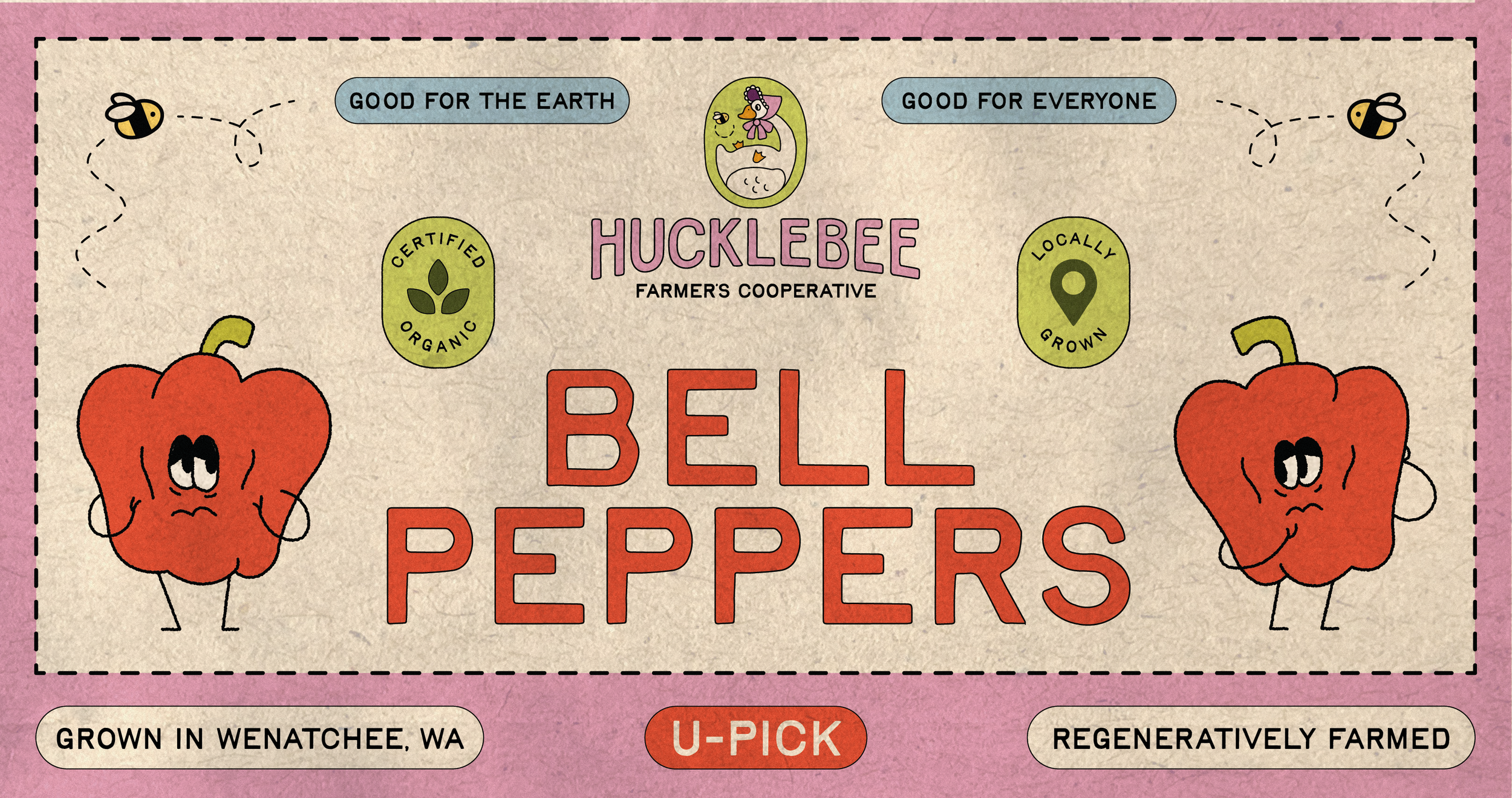
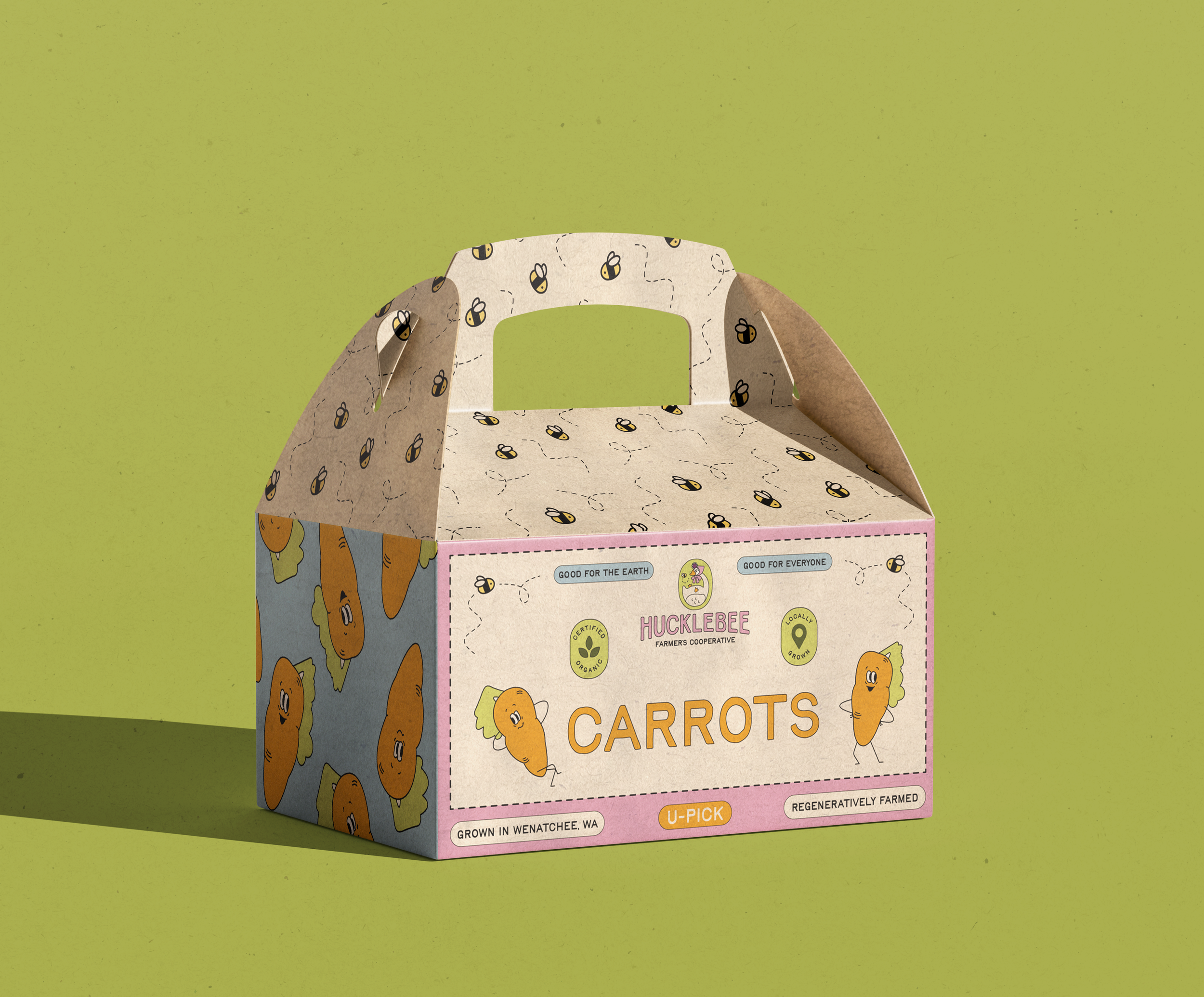
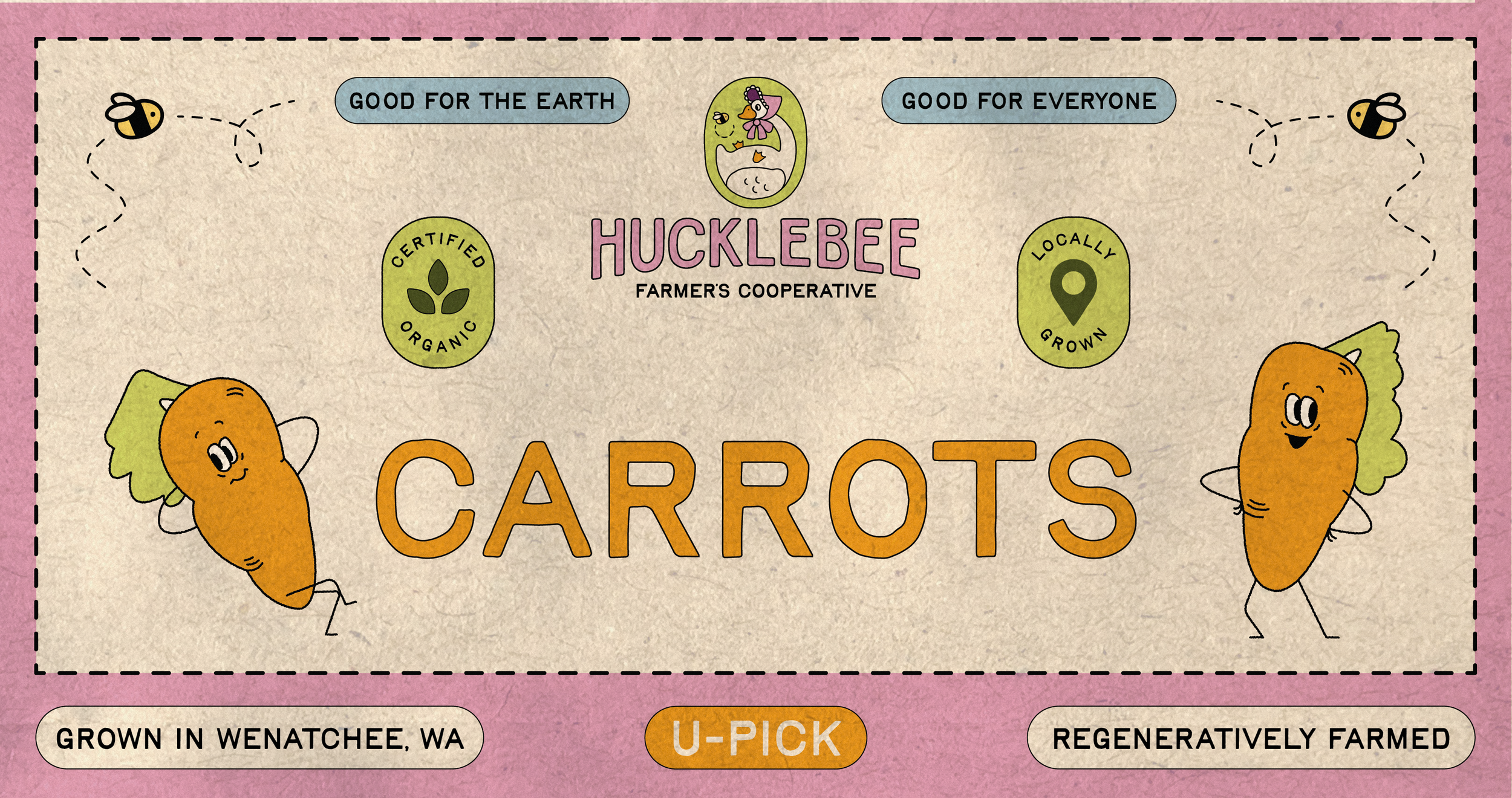
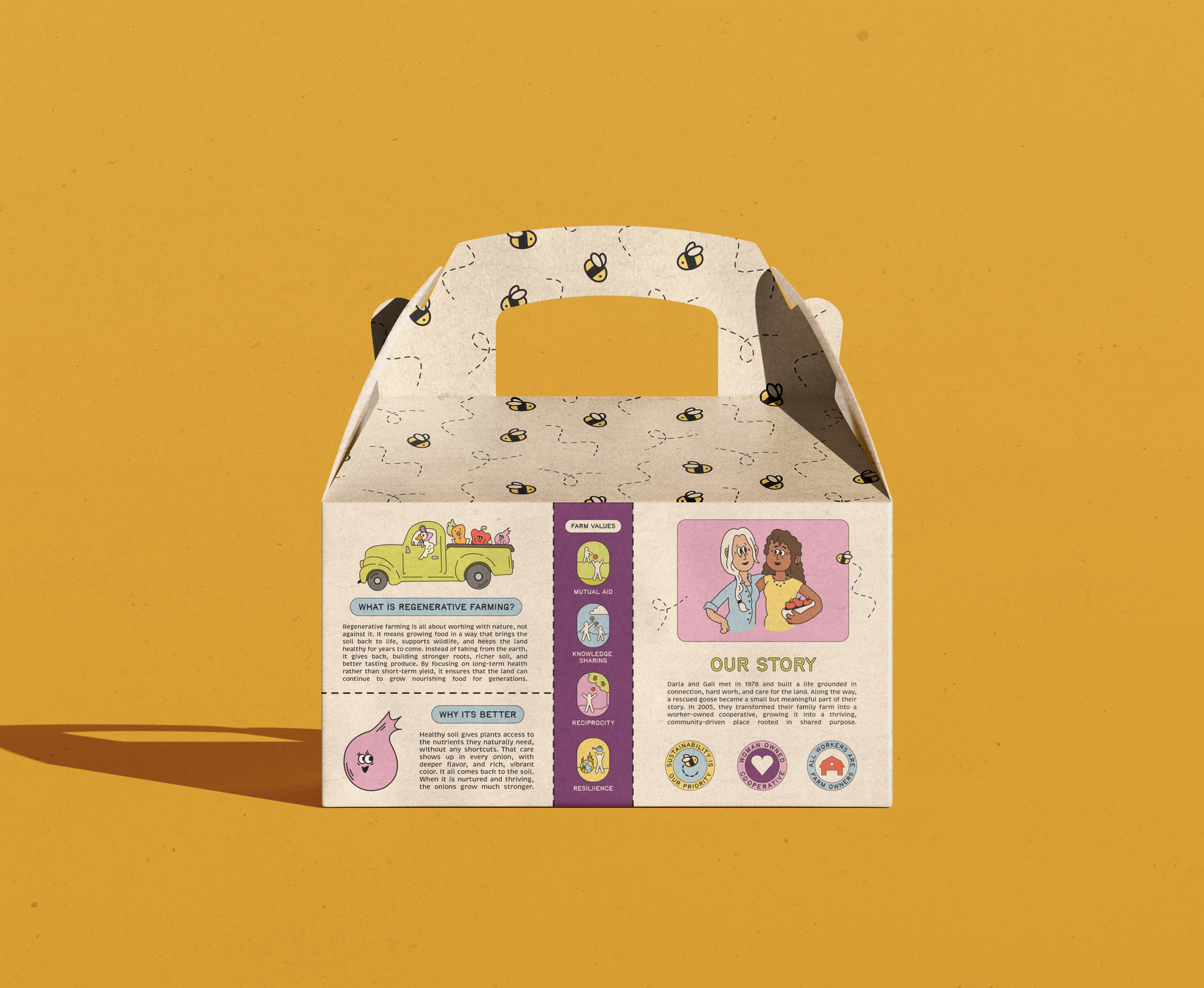
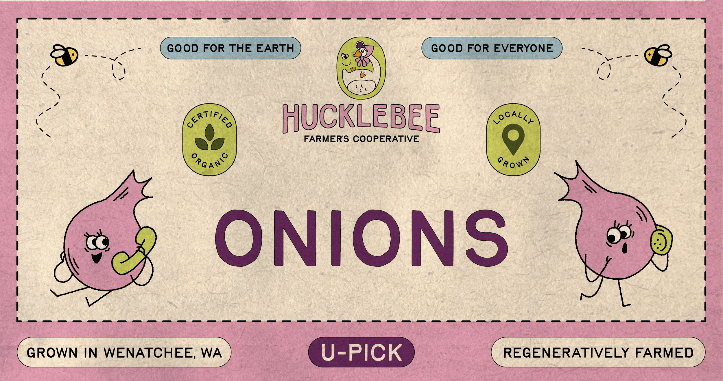
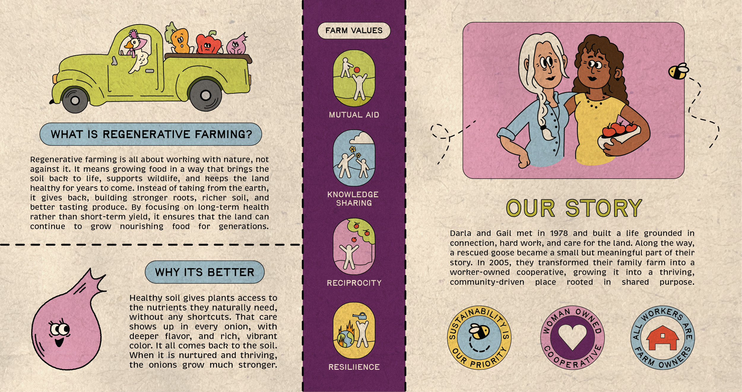
For Hucklebee’s you-pick experience, I designed a series of reusable produce boxes for bell peppers, onions, and carrots that encourage customers to interact directly with the farm and harvest their own produce. I intentionally designed the packaging to resemble recycled materials in order to reflect Hucklebee’s regenerative farming mission and community focused values. Each box features its own personality and color palette while still feeling cohesive within the larger brand system.


WEB DESIGN
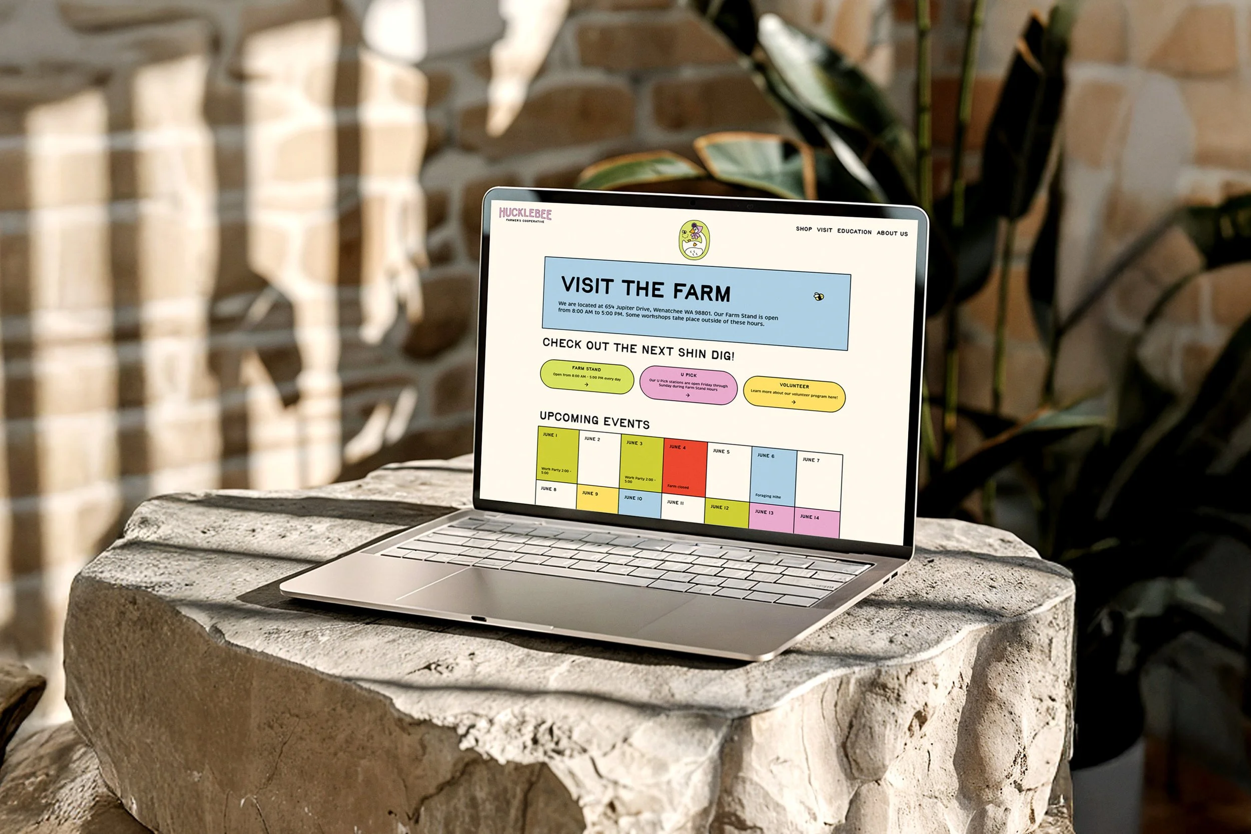
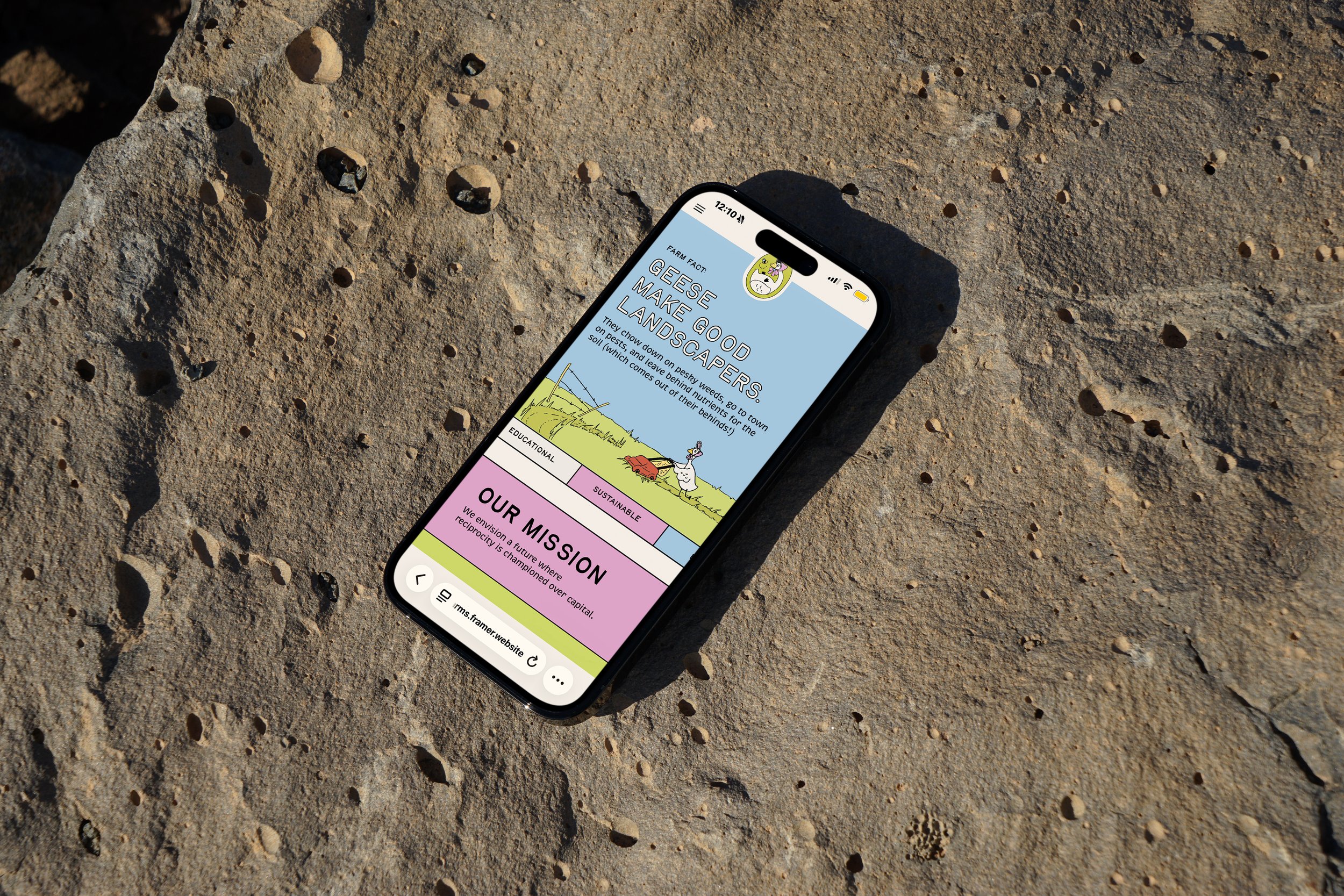
Hucklebee is a farm centered around community, learning, and care for the earth, all rooted in shared experiences. The website was designed as a welcoming touchpoint that encourages users to connect with the farm and engage with its offerings. While the web design remains clean and straightforward, it still carries the playful and inviting spirit of the Hucklebee brand.
